Monday, September 05, 2016

Indian Corn Oil Painting

Here is an Autumn Themed painting that is for sale on Daily Paintworks.

I usually start with pumpkins this time of year, but liked the idea of painting these colorful corn cobs.
Challenging to arrange the cobs for color and deciding how many kernels to paint!! Lots of fun!


Indian Corn
9 x 7 Oil on Canvas Panel


Saturday, April 30, 2016

Study in Grays and a Pop of Color

It seems like I am always looking for new affordable learning opportunities so I'm in my exploration mode and reading a lot as a source for inspiration. 

This painting was just one of those 'what ifs', and wanted to share it here on the blog. The 'what if' was using mixtures in black and white with a bit of color to see if it went dead or not.

I tested the printing on a flat notecard and the color in the background came out much more purplish, but okay for the price!

So now, I've been looking at it for several weeks trying to decide what to do with it. 

I like the neutrals with the intense red color for the visual interest, and will probably try a few more with a variety of intense color spots. 


Study in Gray and Red Berries
8" x 8", Oil on Stretched Canvas

Sunday, April 26, 2015

Stylized Portrait of Angel for Daughter


I actually painted this a few weeks ago, but didn't post because it was a surprise for my daughter. (Ahem... Once a Mom always a Mom.) 

My (adult) daughter lost her kitty last year around Christmas time, and I know how difficult it was for her. The little painting made her smile...

I started the idea back in January, and finally had to accept that my photo reference was not all it could have been for a black kitty with a white chest. It was taken in flat lighting, and I just couldn't get any descriptive details from it so I had to settle on a stylized version.


Angel 
5 x 7 Oil on Canvas Panel
© 2015


Thursday, April 16, 2015

Copyright, Imitation, and Culture

What's your point of view on copyright laws and appropriation for your own artwork?  I know I do enjoy painting an occasional master copy, and find it very valuable to developing my own skills. I am not talking about something that crosses both a legal and ethical line like plagiarism.

I happened to find this thought provoking TEDtalk… on this very topic that presents an argument in favor of imitation.


Here's another interesting article discussing copyright protection of an entire culture!
http://lanfiles-vm.williams.edu/mbrown/Brown-CopyrightingcultureCA98.pdf

I have feelings in favor of both sides even with my own artwork and images. I know whenever I did a project for a corporate client in graphic design, it was a given that they owned the results, and I always felt okay with that arrangement. I often see my design work on the side of trucks and billboards even to this day (from some 12+ years ago) and have to admit I feel a little bit of pride in a good way that they are still using those images.

However, I tend to feel a different emotion when I do my fine art images… maybe it's because it is  more personal, but I would still see it as a compliment if someone likes it enough to copy it.

Tuesday, March 31, 2015

The Illusion of Space in Painting...


Here it is the end of March 2015, 1/4 of the year already behind us.
I recently challenged myself with the idea of conveying more space in my paintings. It came about because my daughter mentioned that some of the images I've done tend to look more dimensional than others so the analytical side kicked in to discover why - my left brain had something interesting to do that supports the right side!! Holistic brain functioning should keep it happy, don't ya think?

This image is still on the easel for ongoing work, and I will not say this grouping is the most beautiful I've ever done, but it did teach me something about texture, and the illusion of  'space'. One point being the background value in relation to the foreground.

It also taught me the importance of choosing the right objects to support the idea I wish to demonstrate as well. This is a great exercise, and so happy about the newly developed  understanding.

I will be adjusting the background, and the value relationships to the foreground. My focus on the texture of objects got me off track a little so will also soften up some edges.

Obviously, this point of view is halfway between eye level and looking down on the table top for a basic starting point so I will be adjusting the height of my table to be higher and/or lower for continued study of spacial relationships in a painting.

Untitled
9 x 12 Oil on Canvas Panel
© 2015


Wednesday, March 18, 2015

Mozart's Music - Health Benefits!

A little segue to another art form that is good for you! Like me, not everyone grows up on classical music, but I do still like to listen to it. Even better, it is now proven to help with memory and learning.

I can only think that more arts in the schools and everyday experience would truly enhance everyone's quality of life.

Classical Music’s Surprising Effect on Genes Vital to Memory and Learning

Enjoy!


Wednesday, March 04, 2015

Back to Oil Painting Basics...

During the past several weeks I've purged every thought/idea that popped into my head without judgment. Just hacking around. I had a blast doing that... however, I decided to get back to basics. The steps described may seem boring to some folks, but when you love something, it is also for the love of the process. 

I started my painting with an instructor (Ron Lukas - in Ballard, WA) back in the 80's. He was from the Russian Impressionist tradition. This study was after a 4 year degree in art. The painting interest has always been with me, but it was hard to find anyone in my area who could teach me the technical skills along with an intelligent understanding of what I was doing! Ron was better at teaching what I wanted to know so I studied with him for a couple years once a week in a group setting.

Ron would do demos at quite a fast pace, and I remember asking myself how does he do that? His brush strokes looked like jewels! I had no clue how he decided on color mixtures, because they clearly didn't match the objects he was painting. And so it goes for every clueless beginning student of painting...

First came the value studies in black and white that I still do to this day. I love it! ;o)
Then came some basic still life in color, and then painting from a live model. I thought everything looked ugly. ;o( Mixing color O-M-G what was I doing???

Filbert brushes are all I used... so I decided to just get back to basics that Ron taught me using a palette similar, but a little different... and a little more in the traditional style.
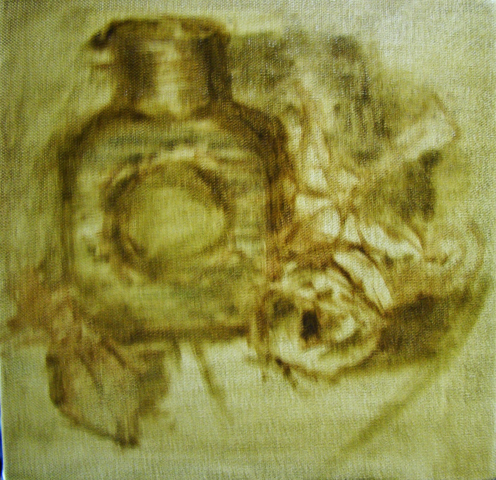
Massing In
The block in of masses only suggesting a few details to be sure I was going to stay with it. This took about an hour to decides what objects to use that I had laying around the studio. Nothing new, this process is the same as most any artist you might run into.

I do tone my canvas when working this way, and my palette is toned to approximately the same value making it easier to judge the mixtures.
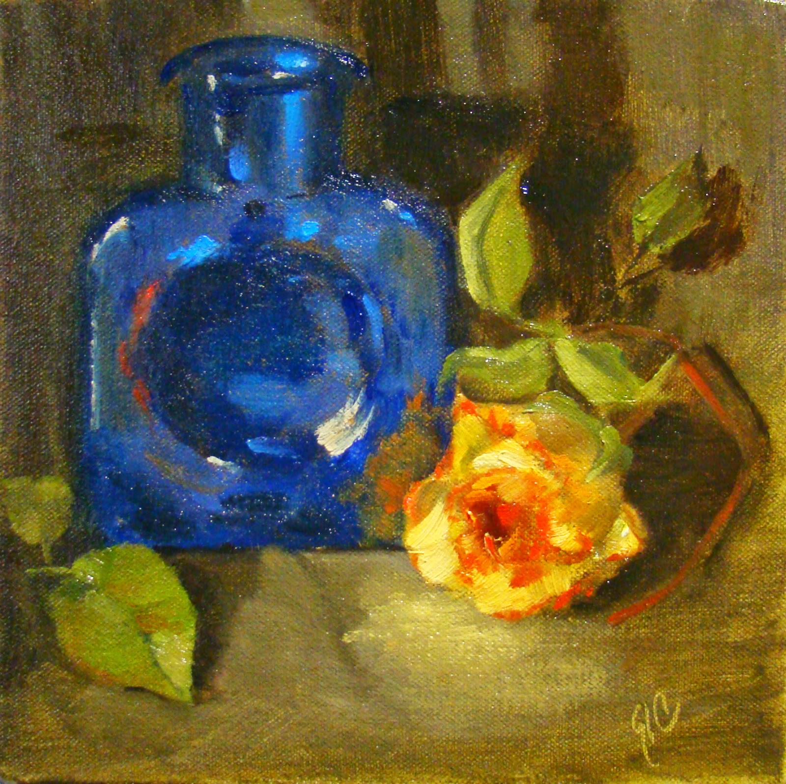


Getting the canvas covered.
Then always working towards the finish and painting more slowly so I felt more confident about the value and color of each paint stroke. This took about 1.5 hours with a few breaks to judge what I was doing from a distance.

Looking in a mirror at the reverse to be sure it didn't look too 'wonky', and was really content in the process.

BTW, I wanted the rose to glow...
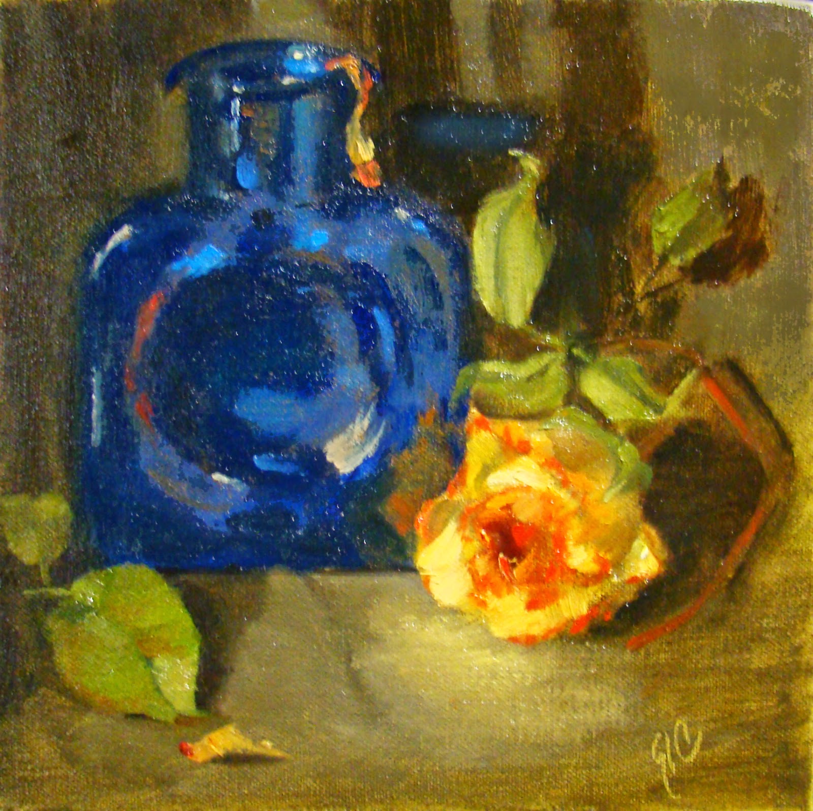


Final Touches
8 x 8 Oil on Stretched Canvas
©2015
After about an hour I went back to see what I thought about the overall image and if it was worth keeping. I always do this and sometimes the answer is no and I'll scrape off everything and start over. This one though was going to survive another day. But (always the but)...

I wanted to do a few more touches to help the eye move through the painting so I added bits of orange peel, softened a few edges, and adjusted values and reflections in the blue bottle.

Note: the blue glass bottle is a darker value, less bluish, and less busy looking in the actual painting. Monitors and the online editors tend to change values even when the original photo is almost perfect.