So here you have it. I've made my first step into the world of 'consciously' using classical geometry for composition.
Because I have so many canvas panels of proportions set by today's standards such as
6 x 8, 8 x 10, etc., I decided to simply use a grid that would divide the space by similar means without going to the phi rectangles, and root rectangles as the Masters did. This grid is known as a 'harmonic armature'.
So in my simple way this painting is the result selecting random objects placing along the grid lines.
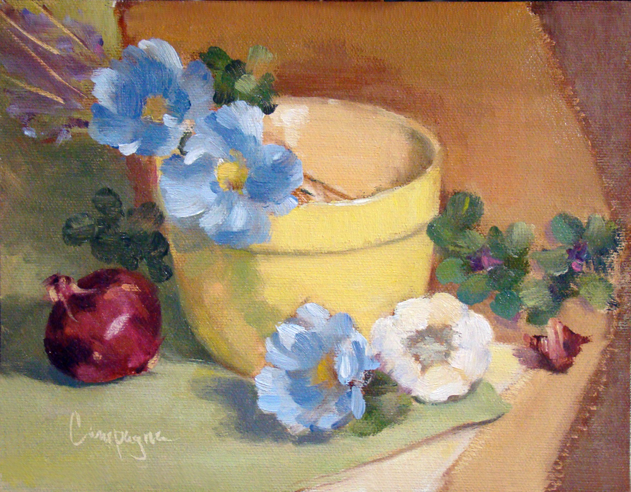 |
Yellow Bowl I
9 x 7 Oil on Canvas Panel
© 2013 |
The canvas panel was an 8 x 10 cut down to 9 x 7 inches; the color palette includes ultramarine blue, cad scarlet, cad yellow light and quinacridone magenta, and white - It is not a true use of the Fletcher system, but I did consider it when choosing the colors.
So back to the classical geometry...
When I did graphic design, grids were used to help arrange elements on the page for readability, and sometimes we tried to squeeze in a little something for visual interest that was less rigid. In this situation I just went with the grid similar to what the old masters may have used in designing their compositions.
This next image shows that grid superimposed to demonstrate what I mean. I did not consider the 'do not' put things in the middle of the picture plane, and 'do not' divide the picture plane in half. I just did what the grid suggested with an occasional 'offset' to keep from getting a headache. ;o)
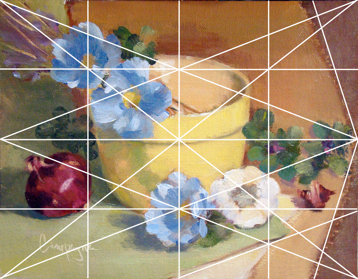 |
| Grid_Yellow Bowl for demonstration purposes. |
|
|
|
|
Several lines are left out with only major points emphasized like elements on the diagonal and and reciprocal (repeated) diagonals. Each of those smaller rectangles are exactly the same ratio as the main panel which I find rather interesting though this is probably obvious to math enthusiasts.
(BTW, this grid is not the rule of thirds that artists sometimes default to when composing an image.) I believe 'harmonic armature' is the correct term for this type of grid - think of it like musical notes e.g., half notes, quarter notes, etc.
Since I did this painting myself using basic information, it is a little difficult to critique as good or bad. Of course, I do wonder what may have happened with this layout if I was not using a grid. My first thought is I may have put the bowl to the left and made other decisions about placement for the remaining objects. I do think I may be able to get more depth of field by changes in proportions with or without the grid - hmmmm.
There are other grid options of course, but I just went with 4, 8, etc. Eventually, I will attempt one in thirds and follow a similar breakdown - perhaps using like objects to see if the result is noticeably different.
As I get more comfortable with this way of looking at composition I
will learn to include arches and semi-circles to move the eye through the picture plane, my hope is to create images that
are more visually compelling for the viewer.
In any case, I welcome your feedback and hope you enjoyed this little demo on using a basic grid.

