Showing posts with label flowers. Show all posts

Saturday, December 03, 2022

Pink Hydrangeas and Porcelain Cup Oil Painting

 Pink Hydrangeas and Porcelain Cup - Intense Color

I grew up with Blue Hydrangeas and thought that was their only color. Things have changed, and Pink Hydrangeas seem to be leading the way lately. Went to my favorite nursery and could not find one blue version of the beautiful flower. I miss the blues, but decided to try pink. Such a warm painting will require a warm frame!

I love painting flowers, but they are one of the most challenging subjects because when you look close there is so much detail. The challenging part for me is editing the details. Since I'm not a hyper realism painter, I enjoy a looser style and prefer to suggest some things letting the viewer fill in with their perceptions while still keeping a bit more detail in the focal areas.


Pink Hydrangeas and Porcelain Cup
8 x 10 Oil Painting ©2020
 
Always check the values:

BW - Pink Hydrangeas and Porcelain Cup
8 x 10 Oil Painting ©2020


Thanks for checking in.


Wednesday, November 30, 2022

Rose Tea Cup and Lilacs - Values

 Rose Tea Cup and Lilacs - Values

This little study took quite awhile to work out.

Oil Painting 5x7
Rose Tea Cup and Lilacs ©2022 


I didn't paint much through COVID-19 so my visual judgments were definitely interrupted. Even with more time to paint, isolation did nothing to help me as an oil painter. 'It' left me feeling paralyzed with fear to move forward.  


Round Baby Blanket

The good news is that I was able to crochet (since I could follow patterns, it meant fewer decisions) and I was finding tea drinking a pleasant experience. Eventually I decided to gather my courage and paint tea cups!

Well, the whole business of painting has so many facets that I felt somewhat overwhelmed like when I first began to study painting. I could not even decide on composition, but determined to work through it so it was back to basics.


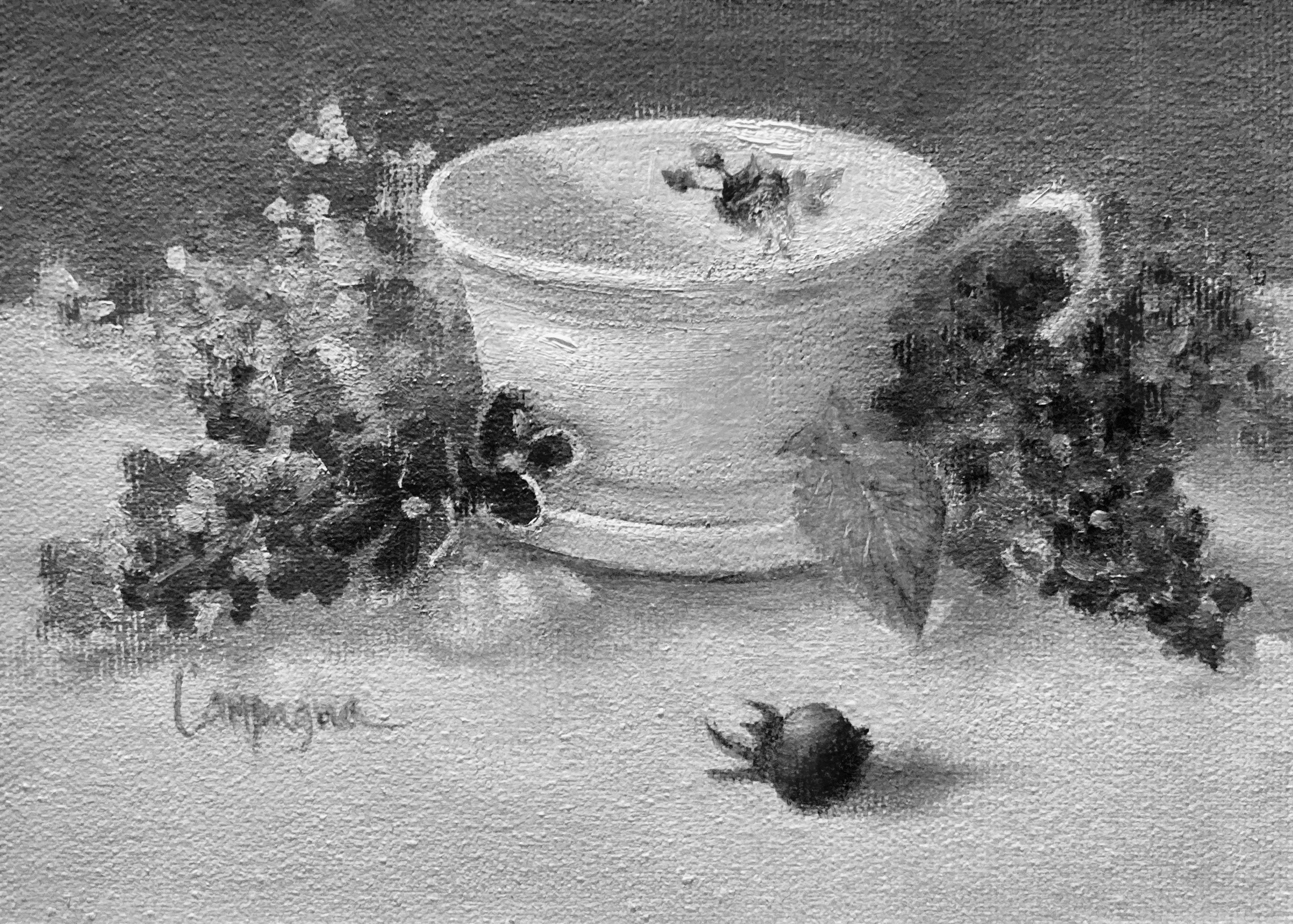
The hierarchy of principles and concepts shifted moment to moment, then I finally settled on working with the values since that is usually what makes a painting most readable. Here's the grayscale version according to auto settings. I'm a bit encouraged to keep going. 


B&W - Rose Tea Cup & Lilacs ©2022

Thanks for taking time to check in.  Be back soon. 


Thursday, April 19, 2018

Studio Campagna Oil Paintings - Toy Series...

I was 'toying' with the idea of painting a few still life with children's toys. This isn't a new concept, but one I've been wanting to do for awhile. The first below was done in 2016, and inspired me to do more.

I'm not going to rush through them, as I want to select items that appeal to me for the project. I would like them to hold a story that makes them more special somehow.

This is the first I'd like to share with you. The back story on this one isn't anything profound, but my love of painting hydrangeas and peonies just called out 'paint me.' The little toy clown is very old and beginning to show signs of wear and tear. I picked him up at a discount store years ago. It reminded me of my grandmother's porcelain dolls. He's only about 6 inches tall, and use to sit near my dressing mirror just for fun.

With very strong warm color, I was surprised by the result. It also seems to have a bit of a Victorian feel so I did some scratching on the panel to give it an aged look.

Toy Clown with Hydrangeas and Peonies
Framed - 8 x 8 inch canvas panel
© 2016
Price $ ebay auction + Shipping

I did't have any other toys laying around, so I had to recruit some new and gently used items for the next paintings. Now to find the other components for cohesive compositions. 

FYI: BTW - I'll be donating 35% of the proceeds from the series to a local charity - 
Foster Champs of Maple Valley, WA.

Saturday, September 17, 2016

Poppies Maybe - Oil Painting

Found the little brass pot at the Goodwill. It's one of my favorite places to scout for still life items. This composition is becoming one of my favorite formats. Enjoy!

Brassy Poppies
5 x 7 Oil on Canvas Panel
Purchase Price $49.01
© 2016
SOLD

Wednesday, September 14, 2016

Lazy Orchid Blooms - Oil Painting

One of those subjects that just seemed to call out "paint me like this." If you decide to frame it, a warm colored frame (not black) does the most justice to the colors in this painting. If not, a table top easel works too!

Lazy Orchid Blooms
8 x 6 Oil on Canvas Panel
© 2016


Wednesday, February 25, 2015

Developing Good Taste...

Developing good taste, as it applies to painting, is a topic foremost on my mind lately.

I've discovered that while I love to paint, applying the paint to the canvas in hopes of liking the result, I sometimes shake in my boots that I might never improve or reach the level I aspire towards. I know this state is common with artists, and hardly a matter of life and death in the strictest sense, but it is so important to me personally, that I will spend days thinking about it.

I'll ask myself if I've set my sights too high, or am I just setting myself up for failure? The only thing that settles me down is knowing I am willing to improve and change what is getting in the way of creating more successful paintings.

I often read articles like this one, or this one, to see if I can nail it down. I look at lots and lots of  images, and can clearly feel what resonates, and what feels off the mark to help me identify where my 'personal taste' fits into the big picture. Through my eyes it goes beyond what is pretty, and includes a measure of how a visual image communicates to me.

Along this journey, my intellectual understanding of the painting process is way ahead of my skills so my own work frequently misses the mark I'm shooting for, but I get that I won't improve if I don't paint.

Also knowing that I've picked up a lot of useless information that gets in the way really frustrates me, but the good part is - I am recognizing that this is happening.

There will be times the painting is acceptable for my skill level, and I save those to refer back to later - using it as a measuring tool for progress or not.

This most recent image is one of those images. It is actually several days of study, one bloom per day, trying different things with brushes, textures, and paint mixtures. The grouping was an afterthought so the composition feels awkward to me. If it looks thrown together void of well thought out design, you are correct. The lighting is only the over head bulb in my studio, and I made up some of the little flowers. Looking at it now, I think it could also use a little more greenery.

I was reluctant to post it, but courage is also a requirement for this process! ;o)

Rose Grouping NFS


Monday, February 16, 2015

Thoughts on the Structure of Roses... and Artificial Props

This week, I'm interested in a series roses, single blooms in various stages and colors to brighten my easel, and continue to work on values. It is sunny and warm for February here  in the NW, and roses are not yet blooming. So I decided to invest into some study time on the structure of roses. Why you may ask?

Well, I will be using artificial props, and there is something usually 'off' about them. It turns out that most real roses have 5 petals in each whorl, so if you are using artificial/silk blooms to study painting, this may not be what you will see. There are rose species that have 4 petals, but not many, and the number of whorls seems to vary as well.

The green 'thingys' that sit at the base of the bloom are called sepals, and match the number of petals in one whorl, and can be seen surrounding the bud. The sepals protect the buds, and later support the blooms.

The stamens produces pollen (male), and the pistil topped by the stigma (female part) is where the pollen is deposited.

At the end of the season, you might see rose hips, the fruit, depending on species. The actual leaves grow in groups, and I left off the thorns too. ;o)

If you would like more detail, the wikipedia can expand on this information, but for purposes of the artist learning to paint this beautiful flower, this short explanation should suffice and point you in the right direction when using artificial props.

I am not going for a photographic look just because I know the basic parts of the rose, but I think it helps to have some understanding of a painting subject. Both paintings are done on linen sheets.

The first is full bloom and clearly a value study. No mystery there, but with this particular silk prop, the petals are distinctly rolled over a bit as if it is wilted.

I decided to use a bright synthetic brush, size 12, to give a sharper edge to some of the petals rolled edges.

Rose Blk/Wht Study
© 2015

The smaller bloom below did not have the correct number of petals of a live rose, but went for it anyway, and hoped to give it the illusion of a natural rose. Knowing it should have 5 actually was helpful. Used various brushes on this one.

MidBloom Red Rose
© 2015
I have now added some new words to my vocabulary, and I don't have to say 'thingy' anymore when talking about roses!

Thanks for reading and hope this helps if you also need to use artificial props.

Monday, January 26, 2015

30/30 Challenge - Roses - Day 25-26

I've had these silk variegated roses sitting in a pale for at least 3 years, and everytime I think about painting them I resist. It looked like an overwhelming task and I'd tell myself to wait until my skills were better. Well I don't know that my skills are better, but I decided to take them on.

I think I got some courage from something I read about how to approach mixing a desired color. I was taught to 'paint what I see', but I always saw what I couldn't paint because of the limits of paint. Nothing as bright as the sun, and nothing as dark and a black hole...
I never really learned how to actually mix a desired color and wasted lots of paint and failed continuously trying to achieve what I was looking for...

Well recently I read that when looking at a setup, identify the color (keep it simple), red, blue, yellow, etc. Don't try to say orangey grayish purple or some other impossible hue that's clearly not on your palette! So after identifying the hue, then mix for the value of that simple color, and also adjust for temperature... and finally adjust for chroma.

Day 25

I wanted to take time to give this new approach some time since I'm usually just guessing what to do with the mixes. I laid in transparent color to start and identified the light and dark areas of the roses.

This took a bit of time, but I let it sit overnight before making more difficult decisions about color. I did some practice on my palette to be sure I could remember the sequence of mixing.

I was putting in a warm background for contrast to the cooler color in the setup. It's all relative... right?


Day 26

The exercise was not as difficult as I imagined. Could maybe adjust a few more things, but my goal was to try the mixing approach.

I have some practice to do, but this effort using the above approach resulted in colors that I was fairly happy with... after all these are variegated silk roses unlikely to ever be seen in nature!

I will attempt again soon and give a little more attention to the composition and light source for stronger shadow pattern.

Thanks for visiting...

Tuesday, January 20, 2015

30/30 Challenge - Solitary Rose - Days 17-18-19

I decided to tackle something a little sweeter smelling after the experience from the last few days!

What better than a Rose? Roses are one of the most beautiful flowers (my other favorite is the peony), but I find them challenging because of all the intricate details. They have a lot of color shapes and values within the overall shape which can make them seem too complicated to tackle. I found however, that if you can describe the main perimeter shape and the main basic interior shape, they are much easier to handle... and remember it isn't necessary to paint each and every little detail unless that is your painting style.

Day 17 

If you read my blog from Day 16, you will perhaps understand why I chose this paint subject and why it is only started. Nevertheless, I am still painting each day, and that's a very good thing.

Materials are acrylic primed linen sheet and my usual bristle brushes and color palette. The rose is and off-white silk type, and while it has a softer look that a real freshly picked bloom, it won't wilt on me while I'm getting my time schedule back on track. It is sitting in the little purple box with glass for reflections.

Wishing myself more time tomorrow to complete!

Day 18

I was working on this while the Seahawks game was on, so that blew the 'more time' idea. If you didn't see it, it was quite an amazing game with the adrenaline in overdrive; the Seahawks won the game in overtime after being behind for a good portion of the game! They are going to the Super Bowl!! I think in all the excitement, I got a little heavy handed. The paint is thicker in places it should be thinner and I was confusing the values. Maybe work with fewer values in the painting even if I see more in the set up. Some of the color also seems too intense. I'm not yet satisfied with the reflection either.

With this many areas in question, it might be a good idea, to scrape down and adjust. The lesson here, again, is to simplify.


Day 19

Day three on one small painting is my methodical brain going full tilt! After posterizing the first painting image in photoshop to simplify the image with fewer values and see what/where would work. This process isn't completely fool proof, but it is another way of evaluating what you've done.

Using the converted image with other judgments (the result of course is still judgment/opinion).

I didn't scrape everything before I started making changes, alas, I started to notice a few other things that I could do!


So this is the end result and time to move on... you may not be able to see the subtle changes, but one TIP to share is that the angle of the flower can make a difference on the complexity of what your painting. I'll be exploring this idea further in the very near future, and may do a black and white study in painting first using only 5 values to see how it translates from that... it may sound funny to some of you, but I'm really having fun training my eye to values - sooooo important in painting!

Thanks for reading...

Wednesday, December 10, 2014

Pumpkin Oil Painting

I know, I know, It's been awhile...  since I last posted anything. Not because I didn't think about it, but I was quite occupied with many other activities. During that time, I even retired from Real Estate and went to Hawaii for a week! Completely unplanned, but a most needed break.
No computer, very little telephone, very little TV and all the other distractions that work life can bring. Loved spending time with my daughter and granddaughter. Helped put things in perspective, Oh yeah!

Anyway, I have a painting or two that havn't been posted yet. Partly because they were not finished. In fact, this one still needs to be signed.

I try to do one fall pumpkin painting each year. It seems a good measure of how my skills and materials are getting along together! ;o) So much to learn, so much to improve...
Eventually, when I do one I can reproduce for a seasons card series, I'll let you know!

Pumpkin in Blues
8 x 16 Oil on Canvas
© 2014/Fall
Call for Price


This painting was on the easel for quite awhile... a few changes here and there. I want to thank the critique group for their feedback too. That single blue petal decided the finish.
Need the signature now... and then the varnish.

Thanks for looking!

Tuesday, October 29, 2013

Ginger Jar with Tangerines and Blue Flowers - Update

So back to my more frequently used palette. I must say the understanding of color is more solid now that I've used the Zorn Palette the past few paintings. By this I mean how color affects the viewer.

This is a simple grouping of objects that have a full value range and intensity of color. My spirit is feeling a little brighter and more at home. The actual jar has a printed design of square calligraphy blocks that I left off because it seemed too busy, but actually thinking this is too plain.

BTW, the blue flowers are a variation of Scilla siberica and perennial Geranium.


Start -  Ginger Jar with Tangerines and Blue Flowers
8 x 10 Oil on Canvas Panel
© 2013

Decided to try it with the design afterall... left a lot of the design off, but it is pretty true to the actual idea. Now if I can just learn how to suggest depth more convincingly.

Update - Ginger Jar with Tangerines and Blue Flowers
8 x 10 Oil on Canvas Panel
© 2013

Monday, September 30, 2013

Still Life - Blue Poppies with Yellow Ribbon

This was started several weeks ago, and just recently finished. I was looking for something simple to paint on a 5 x 7 canvas panel that I had for awhile and thought it should get used. I've got so much 'stuff' in my studio that it's a wonder I can find anything... but that's a discussion for another day.

Blue Poppies with Yellow Ribbon
5 x 7 Oil on Canvas Panel
© 2013
So this is ready to be posted on the last day of the 30 day challenge... I didn't make it everyday this time again, but it did get me painting at least some, and for that I'm grateful.

Along that line of thinking (painting daily), I read a book title 'The ONE Thing' authors Gary Keller and Jay Papasan. It's about achieving extraordinary results (also part of the title). If you are looking for a truthful straightforward read on doing your best at what you love, then I recommend reading this book.

Saturday, August 10, 2013

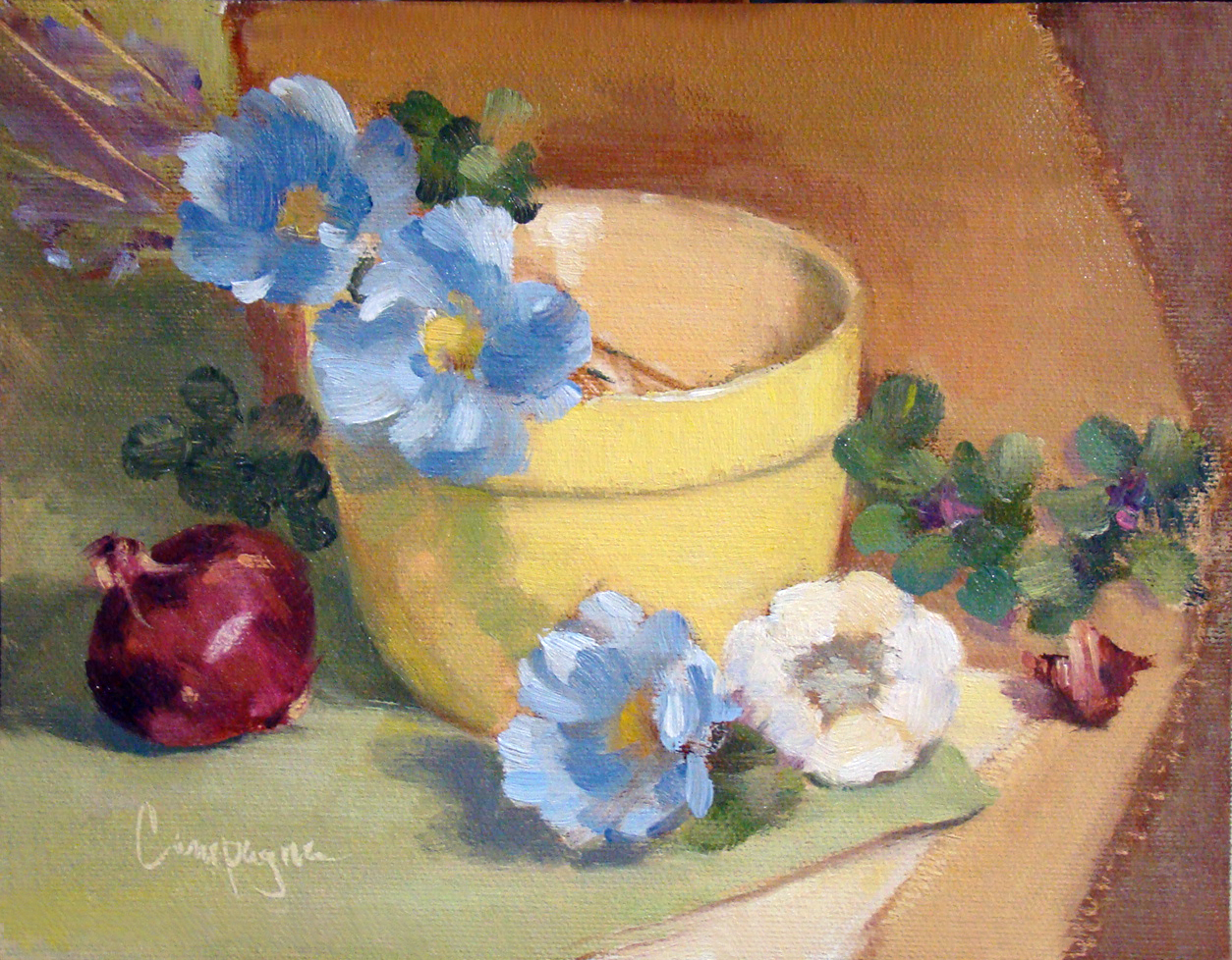
Step One - Classical Geometry Yellow Bowl, Poppies, and Onion

So here you have it. I've made my first step into the world of 'consciously' using classical geometry for composition.

Because I have so many canvas panels of proportions set by today's standards such as
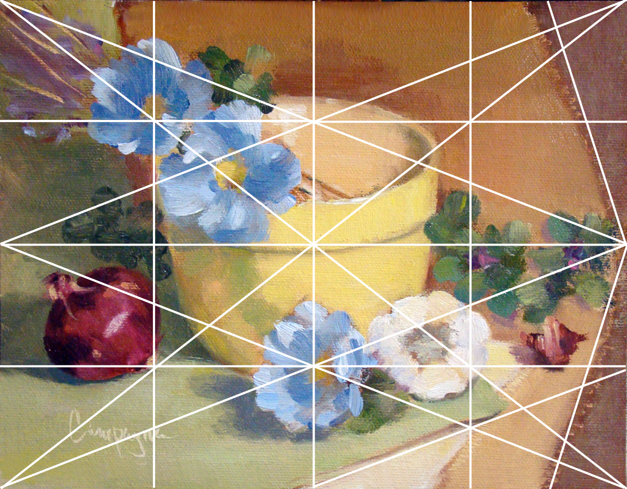
6 x 8, 8 x 10, etc., I decided to simply use a grid that would divide the space by similar means without going to the phi rectangles, and root rectangles as the Masters did. This grid is known as a 'harmonic armature'.

So in my simple way this painting is the result selecting random objects placing along the grid lines. 

Yellow Bowl I
9 x 7 Oil on Canvas Panel
© 2013

The canvas panel was an 8 x 10 cut down to 9 x 7 inches; the color palette includes ultramarine blue, cad scarlet, cad yellow light and quinacridone magenta, and white - It is not a true use of the Fletcher system, but I did consider it when choosing the colors.

So back to the classical geometry...

When I did graphic design, grids were used to help arrange elements on the page for readability, and sometimes we tried to squeeze in a little something for visual interest that was less rigid. In this situation I just went with the grid similar to what the old masters may have used in designing their compositions.

This next image shows that grid superimposed to demonstrate what I mean. I did not consider the 'do not' put things in the middle of the picture plane, and 'do not' divide the picture plane in half. I just did what the grid suggested with an occasional 'offset' to keep from getting a headache. ;o)

Grid_Yellow Bowl for demonstration purposes.


Several lines are left out with only major points emphasized like elements on the diagonal and and reciprocal (repeated) diagonals. Each of those smaller rectangles are exactly the same ratio as the main panel which I find rather interesting though this is probably obvious to math enthusiasts. (BTW, this grid is not the rule of thirds that artists sometimes default to when composing an image.) I believe 'harmonic armature' is the correct term for this type of grid - think of it like musical notes e.g., half notes, quarter notes, etc.

Since I did this painting myself using basic information, it is a little difficult to critique as good or bad. Of course, I do wonder what may have happened with this layout if I was not using a grid. My first thought is I may have put the bowl to the left and made other decisions about placement for the remaining objects. I do think I may be able to get more depth of field by changes in proportions with or without the grid - hmmmm.

There are other grid options of course, but I just went with 4, 8, etc. Eventually, I will attempt one in thirds and follow a similar breakdown - perhaps using like objects to see if the result is noticeably different.

As I get more comfortable with this way of looking at composition I will learn to include arches and semi-circles to move the eye through the picture plane, my hope is to create images that are more visually compelling for the viewer.

In any case, I welcome your feedback and hope you enjoyed this little demo on using a basic grid.

Saturday, June 22, 2013

Shiny Pots and Posies...

One thing that catches my interest as a painter is how reflections play out in a painting, specifically how they worked on shiny metal containers. Even if they are not in shadow, they are still reflected light, yes? So I painted the following two - one copper and one brass.


Copper Pot, Grapes and Posies - SOLD
8 x 10 Oil on Linen Panel
© 2013


Brass, Mini Tangerines and Posies
8 x 10 Oil on Linen Panel
© 2013

Friday, August 24, 2012

Life's Crushing Influences vs GRIT

Pear, Mums Blueberries
8 x 10 Oil on Canvas Board
© 2010 (cropped) SOLD
I recently came across a couple videos - and they got my attention. One is answering the question why kids loose their curiosity and achieve below their abilities in so many cases. In my opinion, this doesn't just happen with studies in Science and Math, but in all areas of learning.

As most of us know, it is even more often seen in the Arts - the  first to go in school budget cuts, etc. Art has to be one of the greatest areas of opportunity for nurturing curiosity - yet how it is perceived and taught in so many cases minimizes its importance for optimal life experiences.


Our life path as artists can be a constant struggle to push through these crushing influences and create anyway. The second video talks about 'GRIT' found on a recent post by The Stuck Creative. As I see it, our job as Artists is to persevere (develop GRIT) while creating beauty and finding ways of making it even more interesting for ourselves and others.

Monday, August 13, 2012

'Where is the dang signup link?!

I worked in the technology industry for all of my past work life; and was one of the first designers to embrace the computer for graphics. However, spending time on the computer everyday, doesn't make me an expert by any means. I am sure most of you will agree technology is sometimes very confusing.

So my point is that I've been writing blog posts for a bit now and thanks to someone who who took a peek, it was called to my attention that I was missing a link and/or widget for anyone who might want to follow.

Seems so silly now, but I'll just bet this is the best time to add this feature since I am finally more comfortable actually writing and posting to my blog.

A huge thank you in advance for everyone who enjoys the posts and of course I always look forward to your comments.

 SOLD
One Peachy Rose
6 x 6 Oil on Canvas Panel
© 2012

Wednesday, July 18, 2012

African Violets

I wanted to paint these for awhile now. I miss having a kitchen window over the sink to put these sweet blooms, so I thought painting some to hang on the wall might be fun. I use to have three little plants in a row so I am pretty sure I'll be painting another version in a horizontal format. These are to share with you.


SOLD
African Violets
6 x 6 Oil on Canvas Panel
© 2012

Monday, July 16, 2012

White Vase with Posies and Grapes

This little painting was something I debated about for a couple of days. I wanted to paint it because of the vase, but couldn't decide what to add. So I just included the first things that came to mind. I mostly like the way the light filters through the flowers onto the right side of the vase. Red grapes are my favorite grape-they snap when they are just right for munching.

SOLD
Vase, Grapes and Posies
8 x 6 Oil on Canvas Panel
©2012