Showing posts with label small. Show all posts

Wednesday, November 30, 2022

Rose Tea Cup and Lilacs - Values

 Rose Tea Cup and Lilacs - Values

This little study took quite awhile to work out.

Oil Painting 5x7
Rose Tea Cup and Lilacs ©2022 


I didn't paint much through COVID-19 so my visual judgments were definitely interrupted. Even with more time to paint, isolation did nothing to help me as an oil painter. 'It' left me feeling paralyzed with fear to move forward.  


Round Baby Blanket

The good news is that I was able to crochet (since I could follow patterns, it meant fewer decisions) and I was finding tea drinking a pleasant experience. Eventually I decided to gather my courage and paint tea cups!

Well, the whole business of painting has so many facets that I felt somewhat overwhelmed like when I first began to study painting. I could not even decide on composition, but determined to work through it so it was back to basics.


The hierarchy of principles and concepts shifted moment to moment, then I finally settled on working with the values since that is usually what makes a painting most readable. Here's the grayscale version according to auto settings. I'm a bit encouraged to keep going. 


B&W - Rose Tea Cup & Lilacs ©2022

Thanks for taking time to check in.  Be back soon. 


Saturday, January 10, 2015

30/30 Challenge - A Change Coming On - Day 10

WOW! This 30/30 Challenge is 1/3 complete!
Have to say it has been a great experience so far, and am mostly able to get this accomplished because of fewer unwanted distractions in my life. Yay!!!
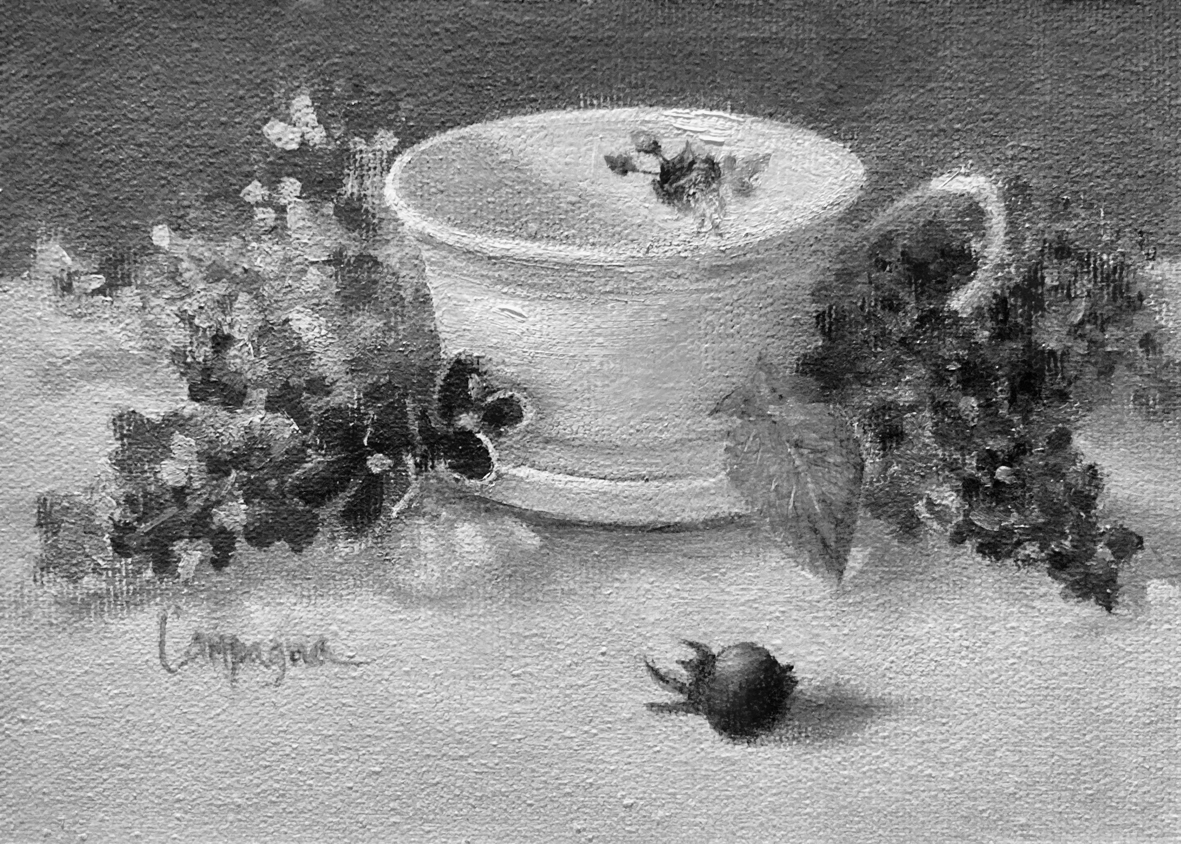
Day 10

This little painting includes some changes on my palette.

After doing some preliminary mixing to test some combinations, I removed the Prussian blue, and will be using Manganese blue instead and will allow for some substitutions.
(The substitutions are so I can use up some of the tubes in my collection of paints.)
© 2015 - Manganese

My palette now has Cad Yellow Light (interchange with lemon yellow), Indian Yellow, Cad Scarlet (interchange with Pyrol Red or cad red light), Quinacridone Magenta (interchange with Alizarin Crimson or Permanent Rose), Ultramarine blue (as usual), and the Manganese blue (interchange with Cerulean blue or possibly Sevres blue). I will also include Yellow Ochre and Transparent Red Oxide and White (will be trying variations of this too). There may be occasion that I'll use a touch of Ivory Black because when mixed with yellows it makes some interesting greens.

To review these first ten days...
Setting a time limit for working on a study... this is good sometimes, and not so good
at other times. If I want to measure to see where I am with my sight skills, it's a good thing. However, if I want to learn something while exploring the possibilities of technique, then 'no thanks'; that's when I want to stand at that easel for as long as it takes for me to get my 'aha moment'.
© 2015 Grayscale
Values are starting to recording more easily when looking at color. Still do not get it the first time everytime, but with practice it does get easier.
© 2015 - Desaturate
Tip: Try using 'de-saturate' when converting to check for values, also use 'grayscale' to check for values - see which is more faithful to the information of the various steps. If you like, you can also use 'posterize' to flatten the value shapes and see if it relates to the way you first put down your basic value shapes before the details.

© 2015 - Posterized

Materials always seem to be changing to fit the desired end result. With this in mind, and after using a variety of canvas types, brush types, and colors, I am learning my preferences, and as a result, more of the preliminary thinking is taking care of itself. This is a plus and HUGE time saver.

Working Without Judgement is so liberating. No pressure, no feeling like I have to perform in a particular way... I can explore the what ifs, and claim the discoveries as my own, even if someone else has already figured it out. I must encourage you to take at least a few hours each week to do something similar. There will be no failure; only a lesson learned!

And finally the Changes I decide to make on my palette or choice of brushes and ground for painting are based on a real understanding of what the heck I'm doing and why. This is a priceless place to be...  I so appreciate my past instructors for giving me the boost to get started (a future blog topic), and yet to make a choice for this process selecting what materials, and exploring the technique is the most honest way for me to work!

A huge thanks to the readers with me on this 30/30 challenge. This first 10 days, I hope have been helpful to you in some way too.

Friday, January 09, 2015

30/30 Challenge - Ideas w/o Judgment Days 7-9

These small studies are using prussian blue as the blue on my palette. It is soooooo strong, but thought it would be worth it to have first hand experience using it.

I like transparent colors alot and Prussian blue is very much transparent. Also used Indian Yellow, and a mix of cad scarlet and permanent alizarin crimson for the three colors on my palette along with white.

I learned that while each of these is a beautiful color, the mixes are more difficult to control with the tinting strength being so different for each. Nevertheless, it was worth the exercise.

Also tried a few 'scratchy' things and props that I have not used in the past, and still limited the time worked on each painting as before - one to one and one half hours.

Day 7

Another apple day. This was done inside a dark purple box with light peeking in. I wanted to keep the colors strong and just went for it. Because the light was so cool, I decided to add TROxide for the darker shadow areas.

Used a piece of glass on the bottom for reflections which gave a bluish color to the area. Love doing reflections. This reflection is stronger than it maybe should be, but like the blue contrast with the reds and yellow in the apple. Also used the end of my paintbrush to scratch lines into the paint. No particular reason except to just act on the ideas that are spontaneously surfacing in this process.

I'd like to comment a bit further on this because it has been liberating. I haven't really tried to do a masterpiece on any of these small paintings, the only requirement is that I paint everyday and brainstorm ideas without any judgment. It's similar to how writers might get started. If you journal, this same process helps get all the crazy stuff out, and sometimes it allows some really good stuff to surface!! Really a fun and interesting way to work... try it!

Day 8

A pear day. Today's exercise was to use less saturated color everywhere except the main subject. Again with the reflection, and recording a simple impression of the pear.

Still just going with any thoughts and ideas that surfaced to see how much my subconscious was engaged. Same color palette and purple box, but as I mentioned was going for less saturated color.

Also tried another brand of round brush which seemed about the same as the other one, except it was more 'bendy' with longer hairs. And my usual bristle...


Day 9

Same apple (you can tell by the yellow spot), but with a plastic green bag used when it was purchased, and still setup in the same small purple box.

Worked on value, more than trying to match color for the surroundings. That plastic bag was no easy task with all the little facets. It would take considerably more time to get it more defined. Remember, I was not trying to get each little facet rendered, only the illusion, and only in about an hour's time. BTW, this poor apple is no longer edible! ;o(

Finally, what I can say about Prussian blue is it is beautiful and challenging to use, but worth the effort.


Sunday, January 04, 2015

30/30 Challenge - Values - Days 1 thru 3

I decided to join this challenge (30/30 Day Challenge) to re-inforce my determination to paint more in 2015... my posts won't be daily, to ensure I do not spend too much time posting more than necessary; and it might make for more interesting reading.

I will likely be posting unfinished paintings along with some that may get to the finished stage. My main goal is to paint or draw each day, but also will use this as a study tool and working on various elements in art. Will also be exploring materials.

These first were each given a short time with the idea of translating them later into B/W images to check my values. As you may already know, seeing correct values in colored paint is one of the biggest obstacles a painter faces. This is one exercise that I'll be repeating in various subjects to see if it makes a difference on how I see the values.

I know the reader will be at a disadvantage not able to see things in person, and there is some undesirable glare from the lighting - but here we go... and hopefully it will give you some ideas to work on too.

Subject: Values/Apples - keeping things basic to start.

Day 1
Using lighter a background to see if I can still pull off the value relationships. I do see the relationships and think maybe the values could be pushed a bit more... The light I used on the setup wasn't very strong light so this is about right and true to what was there. The halo around the shadow was actually there...


I think these apples have more detail than I needed to show.
 
Day 2
Once again with the apples... about the same today. I remember that nothing in shadow should be as light as the area(s) in the light. Since I used a light background, it will be a bit more difficult to follow this rule.


Less detail, and notice the yellowish spot doesn't show separately
from the red shadow area.

Day 3
Third try on the apples with the same setup including the lower lighting. Hmmm... except for the highlights, the background is still picking up more light than the rule would suggest.  Now, I really do wonder about that rule... will try apples again later in the month with a stronger lamp to see if it makes a difference. My thoughts are that this rule applies with each object, and not necessarily all object collectively in the entire painting.


NEXT comes playing around... ever wonder what to do with all those studies that will never be sold and likely tossed in the garbage in the very near future? How about wallpaper or quilting pattern ideas!  ;o)

© 2015


Friday, December 12, 2014

Something about lemons and oil painting...

I don't know why exactly, but lemons are one of the prettiest things to paint. The light and shadow temperatures are easy to see, and harmonize so nicely. I don't even think about the sour pucker power they stimulate at other times. In painting, they just seem beautiful, fresh, and sunny. Must be the color, texture, and smell that I enjoy.

Was working towards a higher keyed painting with this couple... loved the extra little blossom too. Computer insisted on making the background more blue than aqua, but the painting looks quite nice in a gold frame. Might have to hang this one for myself.

Blossom between Two Lemons
8 x 6 Oil on Canvas Panel
® 2014

Saturday, October 26, 2013

Turban Squash - Still Life

This was getting back to my usual palette - and all I can say is what a difference. It shouts in comparison. Lots of fun to paint. Could end up in the oven...


Turban Squash - SOLD
6 x 6 Oil on Canvas Panel
© 2013

Sunday, November 11, 2012

Fall Arrangement

I wanted to do at least one image for fall and went with 8 x 10 canvas panel. Still working with the lighting in the studio to find out the best approach - the idea was to have a little brighter mood. Attempted a random arrangement with only a small effort to influence the composition.

The pine cones were gathered while walking my dogs and I have enough to use as  fire-starters for building a fire this winter. They really are fun to paint. ;o)


Fall Arrangement - SOLD
8x10 Oil on canvas panel
© 2012

Thursday, November 08, 2012

Really Fresh Garlic!

This painting is the second done in my new studio. Subject is 'really fresh garlic' pulled straight from the ground. My neighbor Cindy use to grow these in her garden and they were amazing! I used a photo as reference, and added a little artistic license with color.

I think the most amazing thing about this painting for me was when I took it to a critique session, it sold on the spot! We never really know when someone will fall in love with an image. ;o)

Really Fresh Garlic - SOLD
6x8 oil on canvas panel
© 2012

Monday, July 23, 2012

Some Things About Online Auctions

Victorian Rose


The online auction scene has been great as a first step for me to get my work out and seen by as many eyes as possible. The images are small and starting prices have been set low for a couple reasons. One is to keep the art affordable as to entice a sale - so even folks on a small budget can buy an art piece; and also to see how the value is perceived by someone who buys because they really like and want the painting - not just because it is cheap.


However, I learned that getting them seen by people is a puzzle sometimes, and has a lot to do with how it is listed to fit the searches people do.


One of my buyers who is also my biggest fan right now taught me this lesson. She said originally she found me by 'accident' and then put me in her favorites, but shared with me how she did her searches. BIG HELP!!!!


I finally figured out that sometimes using the same words in the title/description as in the search labels and tags is a good way to be found.


If you my dear reader have any other helpful ideas that you'd like to share to get the work in front of more eyes, please let me know.