Showing posts with label New Images. Show all posts

Wednesday, November 30, 2022

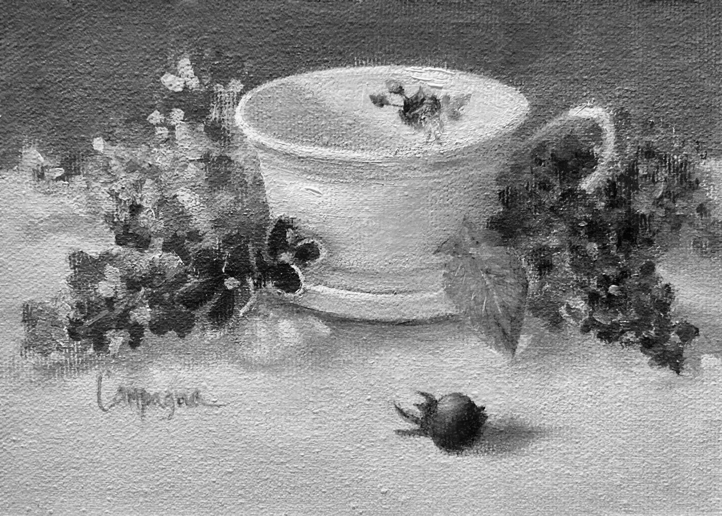
Rose Tea Cup and Lilacs - Values

 Rose Tea Cup and Lilacs - Values

This little study took quite awhile to work out.

Oil Painting 5x7
Rose Tea Cup and Lilacs ©2022 


I didn't paint much through COVID-19 so my visual judgments were definitely interrupted. Even with more time to paint, isolation did nothing to help me as an oil painter. 'It' left me feeling paralyzed with fear to move forward.  


Round Baby Blanket

The good news is that I was able to crochet (since I could follow patterns, it meant fewer decisions) and I was finding tea drinking a pleasant experience. Eventually I decided to gather my courage and paint tea cups!

Well, the whole business of painting has so many facets that I felt somewhat overwhelmed like when I first began to study painting. I could not even decide on composition, but determined to work through it so it was back to basics.


The hierarchy of principles and concepts shifted moment to moment, then I finally settled on working with the values since that is usually what makes a painting most readable. Here's the grayscale version according to auto settings. I'm a bit encouraged to keep going. 


B&W - Rose Tea Cup & Lilacs ©2022

Thanks for taking time to check in.  Be back soon. 


Sunday, January 04, 2015

30/30 Challenge - Values - Days 1 thru 3

I decided to join this challenge (30/30 Day Challenge) to re-inforce my determination to paint more in 2015... my posts won't be daily, to ensure I do not spend too much time posting more than necessary; and it might make for more interesting reading.

I will likely be posting unfinished paintings along with some that may get to the finished stage. My main goal is to paint or draw each day, but also will use this as a study tool and working on various elements in art. Will also be exploring materials.

These first were each given a short time with the idea of translating them later into B/W images to check my values. As you may already know, seeing correct values in colored paint is one of the biggest obstacles a painter faces. This is one exercise that I'll be repeating in various subjects to see if it makes a difference on how I see the values.

I know the reader will be at a disadvantage not able to see things in person, and there is some undesirable glare from the lighting - but here we go... and hopefully it will give you some ideas to work on too.

Subject: Values/Apples - keeping things basic to start.

Day 1
Using lighter a background to see if I can still pull off the value relationships. I do see the relationships and think maybe the values could be pushed a bit more... The light I used on the setup wasn't very strong light so this is about right and true to what was there. The halo around the shadow was actually there...


I think these apples have more detail than I needed to show.
 
Day 2
Once again with the apples... about the same today. I remember that nothing in shadow should be as light as the area(s) in the light. Since I used a light background, it will be a bit more difficult to follow this rule.


Less detail, and notice the yellowish spot doesn't show separately
from the red shadow area.

Day 3
Third try on the apples with the same setup including the lower lighting. Hmmm... except for the highlights, the background is still picking up more light than the rule would suggest.  Now, I really do wonder about that rule... will try apples again later in the month with a stronger lamp to see if it makes a difference. My thoughts are that this rule applies with each object, and not necessarily all object collectively in the entire painting.


NEXT comes playing around... ever wonder what to do with all those studies that will never be sold and likely tossed in the garbage in the very near future? How about wallpaper or quilting pattern ideas!  ;o)

© 2015


Monday, December 15, 2014

Onion Basket Oil Painting

Onions were the first food I ever attempted to draw, or paint. The shape, papery layers, and color variety are just perfectly tempting for oil painting.

Tried several variations on the arrangement before settling on this one. Wanted to work on looser brushwork and textural forms, and thought more variety would keep me from over focusing. Lots of different textures with glass, fabric, smoothness of onions, and roughness of the basket.

While finishing up with this painting, I had an 'aha moment' about selecting a visual idea for any painting; keeping the concept in mind while working on the painting, can be the real challenge.


Onion Basket
16 x 8 Oil on Canvas Panel
© 2014
Will post another onion piece soon still on the easel with less textural elements. Yikes, also running out of time to do an Xmas painting. Better get going... still catching up from my trip to Hawaii!! ;o)

Thanks for looking!

Sunday, November 03, 2013

Christmas Card Landscape Sketch

I very much want to paint something for printing my own Christmas cards this year. The thought is for it to maybe be something that could be hung anytime of year. The following is the first quick sketch done for this goal.

You might be thinking that a yellow sky is unlikely for an evening/dusk scene, but that the imagination of it, and I kinda like the harmony. This is not the completed image, only a start... it is a composite of photo resources and imagination. I want to add something, but haven't quite settled on what(?).

Should it be something figurative, or something holiday related even though it would be counter to 'hung anytime of year'?

Will sketch out a couple more ideas before I make a final decision. Better get out to the easel!

Thanks for looking!

Prelim Sketch - Winter Landscape
9 x 12 Oil on Canvas Sheet
© 2013


Saturday, October 26, 2013

Turban Squash - Still Life

This was getting back to my usual palette - and all I can say is what a difference. It shouts in comparison. Lots of fun to paint. Could end up in the oven...


Turban Squash - SOLD
6 x 6 Oil on Canvas Panel
© 2013

Tuesday, October 15, 2013

Still Life - Footstool w/ Book

Well I proceeded with the still life I began a few days ago and this is the current result... whether I toss it or make some changes is yet to be determined.

In any case, my intent was to follow through with this effort... it's more like a quick study illustration to me than a 'beautiful painting'.

The charcoal drawing in the previous post had more drama even with the compositional challenges. What I love tho is the shadow of the candle stick on the left - the distortion is interesting.


Footstool w/ Book
9 x 7 Oil on Canvas Board
© 2013
I used the adapted Zorn palette again. I think the flower could be smaller, and the wine glass seems too busy. Those would be the main changes I would make with this. A more simple wine glass without all the faceted cuts that catch the light in strange ways. I'll also adjust the shadow color under the left side of the footstool.
 **********

2 hours later: could not leave it for tomorrow... had to make a few changes today - here's the result. Less detail in the wine glass/check! Slightly smaller flower/check! If I ever start another from scratch, I'd make it a bud instead of full bloom. Little darker in left side shadow under the footstool/check! Now I can do something else!

Revised Image
**********

Several Days Later: had a change of mind on the  tone of the green foot stool. It seemed to be competing with the flower.


Revised Image 2