Saturday, August 10, 2013

Step One - Classical Geometry Yellow Bowl, Poppies, and Onion

So here you have it. I've made my first step into the world of 'consciously' using classical geometry for composition.

Because I have so many canvas panels of proportions set by today's standards such as
6 x 8, 8 x 10, etc., I decided to simply use a grid that would divide the space by similar means without going to the phi rectangles, and root rectangles as the Masters did. This grid is known as a 'harmonic armature'.

So in my simple way this painting is the result selecting random objects placing along the grid lines. 

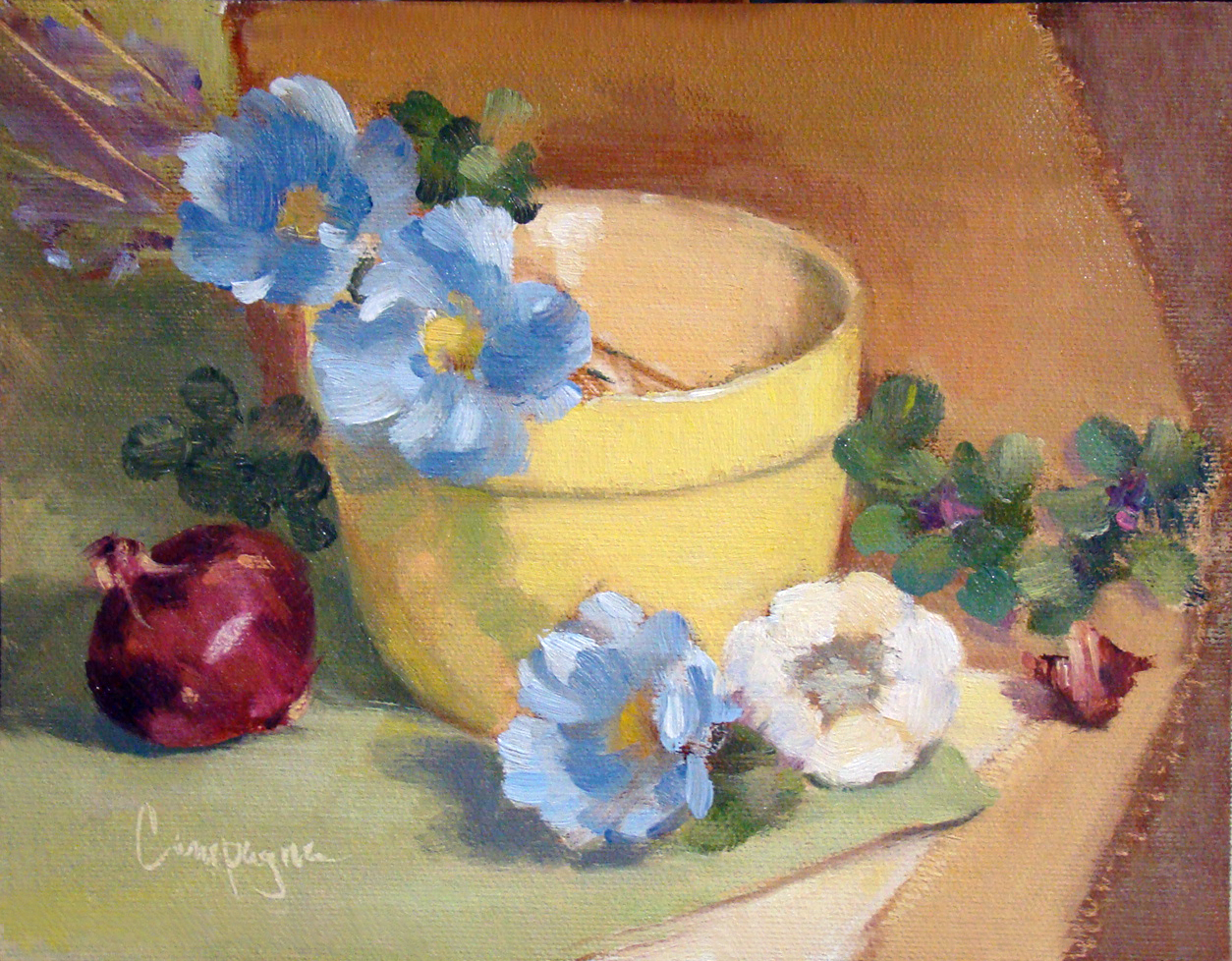
Yellow Bowl I
9 x 7 Oil on Canvas Panel
© 2013

The canvas panel was an 8 x 10 cut down to 9 x 7 inches; the color palette includes ultramarine blue, cad scarlet, cad yellow light and quinacridone magenta, and white - It is not a true use of the Fletcher system, but I did consider it when choosing the colors.

So back to the classical geometry...

When I did graphic design, grids were used to help arrange elements on the page for readability, and sometimes we tried to squeeze in a little something for visual interest that was less rigid. In this situation I just went with the grid similar to what the old masters may have used in designing their compositions.

This next image shows that grid superimposed to demonstrate what I mean. I did not consider the 'do not' put things in the middle of the picture plane, and 'do not' divide the picture plane in half. I just did what the grid suggested with an occasional 'offset' to keep from getting a headache. ;o)

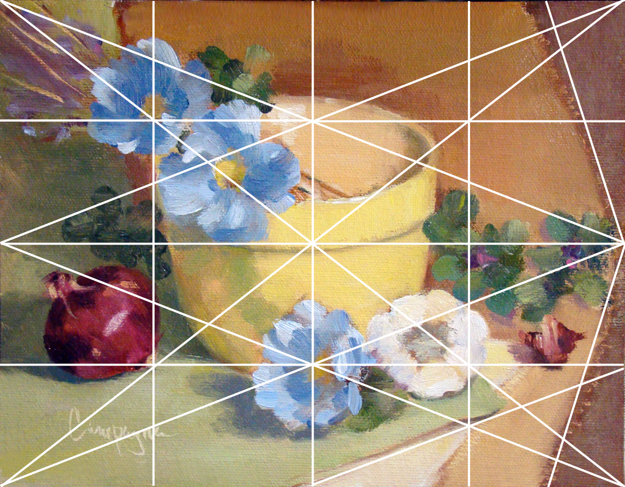
Grid_Yellow Bowl for demonstration purposes.


Several lines are left out with only major points emphasized like elements on the diagonal and and reciprocal (repeated) diagonals. Each of those smaller rectangles are exactly the same ratio as the main panel which I find rather interesting though this is probably obvious to math enthusiasts. (BTW, this grid is not the rule of thirds that artists sometimes default to when composing an image.) I believe 'harmonic armature' is the correct term for this type of grid - think of it like musical notes e.g., half notes, quarter notes, etc.

Since I did this painting myself using basic information, it is a little difficult to critique as good or bad. Of course, I do wonder what may have happened with this layout if I was not using a grid. My first thought is I may have put the bowl to the left and made other decisions about placement for the remaining objects. I do think I may be able to get more depth of field by changes in proportions with or without the grid - hmmmm.

There are other grid options of course, but I just went with 4, 8, etc. Eventually, I will attempt one in thirds and follow a similar breakdown - perhaps using like objects to see if the result is noticeably different.

As I get more comfortable with this way of looking at composition I will learn to include arches and semi-circles to move the eye through the picture plane, my hope is to create images that are more visually compelling for the viewer.

In any case, I welcome your feedback and hope you enjoyed this little demo on using a basic grid.

Saturday, July 20, 2013

Sacred Geometry in Classical Art

Mathematical studies of the Fibonacci Series and golden section/sacred geometry is not usually the priority for a fine art painter of today. We moderns don't think about sacred geometry too much - we mostly enjoy the act of painting and kinda ballpark the rule of thirds in our layout, and most often come up with pleasing compositions as we paint on the standard canvas sizes carried by art suppliers.

But I've been thinking a lot about the geometry used in classical art that defined the composition. The classic masters did use it. Learning how to draw a root2 or phi rectangle doesn't create a beautiful painting in itself, it does help us with proportions that can be used like a template to suit and support the original concept of the painting. Graphic design uses templates for columns and page layout, so why not fine art painting.

This youtube video may be a bit overstated with all the triangulations, but I do think it makes the point that the old masters used geometry in their work - sacred or not. 


Note: These lines are only to show points of interest in the overall two dimensional picture plane, and not intended to suggest perspective for a three dimensional illusion. Perspective and its lines of delineation are a separate area of study.

Saturday, July 13, 2013

'Why' do artists paint on canvas and linen?


As a beginning painter, or a beginner of anything, we almost always followed the lead given by the instructor(s) providing the 'how to' - isn't that what we always do to learn something new - whether mimicking our parents as children, or how to do 'math' in school. We simply do what the current authority figure does or says, and that's how we learn.

On the topic of oil painting, I love the texture and other qualities of oil paint - so when I decided to learn to paint, it was naturally my choice of medium. Learning how to use it well isn't so simple. In fact it is more difficult than math in someways, wouldn't you agree? ;o)

So now that I've begun to study the classical proportions of a picture plane, and as I go along learning, I decided to use rolls of canvas and/or linen so I can cut my own specific  sizes. Using the past information given to me by 'several' authorities on painting who seem to have a wide range of approaches to things, it was no surprise to me that while warming my morning coffee, a question pops into my head asking 'why' do artists paint on canvas and linen?

I mean, we have so many materials to chose from, why fabric for fine art? At first impression, fabric brings to mind things like dyed cloth for clothing, and embroidery on dish towels. While I appreciate that both these examples can be beautiful, neither of them makes the leap in my mind to the idea of fine art.

So the best I can discern is this:

1) The obvious is that linen and canvas are light weight and much easier to transport than say a venetian plaster wall. One can stretch it on bars made into frames for showing, mount it on a rigid support, or roll it up for safe keeping.

2) Linen and canvas allows for better adhesion of the paint so it doesn't flake off as with a wooden panel or plaster surface.

3) And three, 'linen' especially gives a quality to the image that I personally find difficult to resist.

In design we learn that 'Form follows function', but once you get past the functional and practical aspects, it becomes, and is, more of an aesthetic thing.

As it turns out, after considering my thoughts I did a little research, and discovered I wasn't so far off in my thinking for the first two reasons listed. The Wikipedia resource suggests the same reasons for using fabric. See Oil Painting.

However, the third reason I mention is the 'WHY' that might be more elusive to identify (and not in Wikipedia), especially if you don't have the same aesthetic sensibilities.

I've painted on glass, wood, metal, rocks, canvas, and paper for oil painting, but linen is by far most appealing to me. I can mount it if I want a rigid surface, I can stretch it and experience a pleasurable 'give and take' with the surface as I apply paint. It can be used with or without a ground depending on purposes of the final image. I can be scrub into linen, or lay down paint smoothly and lightly; I can apply thin paint washes, or build up texture on the surface making it more sculptural. If I change my mind, I can wipe it away and begin again, and so it goes.

Fabric, especially linen, is simply a wonder surface to work on. Hmmm... wonder who the first person was who tried it?

Saturday, July 06, 2013

Study of the classical renewed...

Since seeing the Rembrandt painting at the Seattle Art Museum (the Kenwood House Collection) this past Spring, I've become more and more curious about classical work regarding the methods of the old masters.

Rembrandt - Self Portrait
Oil on Canvas
ca. 1665

The self-portrait of Rembrandt is engaging. The composition, the quality of paint, everything about this painting screams at me, but the language sounds foreign. His small etchings had/have a quality that is compelling in a similar way. The other paintings in the show had/have something intriguing about them too - none of which I could quite put my finger on as a modern viewer... and in spite of years of art training, I felt inadequate - like something was missing in my understanding. Let me explain...

Selecting objects for a still life is always an exercise that challenges me. I see beauty in so many things and want to express it in a pleasing way that you might see it too. After selecting items, working with how do I arrange them - what size do I paint - and after  coming up with a passable solution, it changes several times during the process. And this I've discovered is one of the interesting things about classical work.

In a classical painting there is an underlying framework for composing the painting. You've heard of the 'golden section' or 'divine proportion', but there is a tremendous amount more to it, and many of us more modern painters have no idea about how to utilize it like the masters did for our compositions. Could it really make for better paintings and perhaps achieve a true masterpiece?

This process was used in painting and sculpture and all manner of the arts. Just like learning an instrument and or movements in dance, there are scales and fundamentals that one needs to learn before they can perform beautifully. The same goes for painting.

I know we always hear suggestions about selecting random elements and being spontaneous for my paintings, but for me this results in sooooo many failures and disappointments. So now, I fear I will become a snob of sorts rejecting efforts that are not 'designed' in a more classical way. ;o)

I have a good sense of layout as a graphic designer, but even this seems basic and not very artistic or satisfying with our modern way of doing things. I enjoy painting very much, but when I begin to paint I often ask myself if the world really needs another oil painting. Maybe not...?

However, for my next several painting efforts, my plan is to revisit some past images of my own doing to start from, and begin to learn how to actually 'design' a painting like the Masters might have done - using the same objects, and see if it makes a difference. Sounds like work, but what the heck - I like a good challenge.

BTW, the study resources I plan to use are based on the Barnstone Studio program. He has some free videos to preview on his site that immediately rang true for me.

During the next several posts I will share my experiences with this study.


Saturday, June 22, 2013

Shiny Pots and Posies...

One thing that catches my interest as a painter is how reflections play out in a painting, specifically how they worked on shiny metal containers. Even if they are not in shadow, they are still reflected light, yes? So I painted the following two - one copper and one brass.


Copper Pot, Grapes and Posies - SOLD
8 x 10 Oil on Linen Panel
© 2013


Brass, Mini Tangerines and Posies
8 x 10 Oil on Linen Panel
© 2013

Friday, June 14, 2013

Fe, Phi, Fo, Fum - I smell the blood of an Englishman!

I had to share this Myron Barnstone video - He is 80 years young (when I wrote this post), and opinionated in the best possible way. 

In this video, he shares his take on the ongoing question "What is Art"?


Don't you love it???

Myron Barnstone has passed away now 10/29/16, but his daughter is keeping his legacy going.
She has started a Facebook page also to help his students stay connected.

Wednesday, February 20, 2013

Sunflower and Tulips

OMGosh - I find myself doing a double take with this strong color combination. Not a delicate rendering by any means, but certainly catches my eye.

The sunflower was my main interest mainly because I am determined to paint them since I haven't been able to grow any in my garden.

Sunflower and Tulips - SOLD
6 x 8 inches on Canvas Panel
©2013
I am pretty sure I'll be painting more sunflowers and tulips soon...