During the past several weeks I've purged every thought/idea that popped into my head without judgment. Just hacking around. I had a blast doing that... however, I decided to get back to basics. The steps described may seem boring to some folks, but when you love something, it is also for the love of the process.
I started my painting with an instructor (Ron Lukas - in Ballard, WA) back in the 80's. He was from the Russian Impressionist tradition. This study was after a 4 year degree in art. The painting interest has always been with me, but it was hard to find anyone in my area who could teach me the technical skills along with an intelligent understanding of what I was doing! Ron was better at teaching what I wanted to know so I studied with him for a couple years once a week in a group setting.
Ron would do demos at quite a fast pace, and I remember asking myself how does he do that? His brush strokes looked like jewels! I had no clue how he decided on color mixtures, because they clearly didn't
match the objects he was painting. And so it goes for every clueless beginning student of painting...
First came the value studies in black and white that I still do to this day. I love it! ;o)
Then came some basic still life in color, and then painting from a live model. I thought everything looked ugly. ;o( Mixing color O-M-G what was I doing???
Filbert brushes are all I used... so I decided to just get back to basics that Ron taught me using a palette similar, but a little different... and a little more in the traditional style.
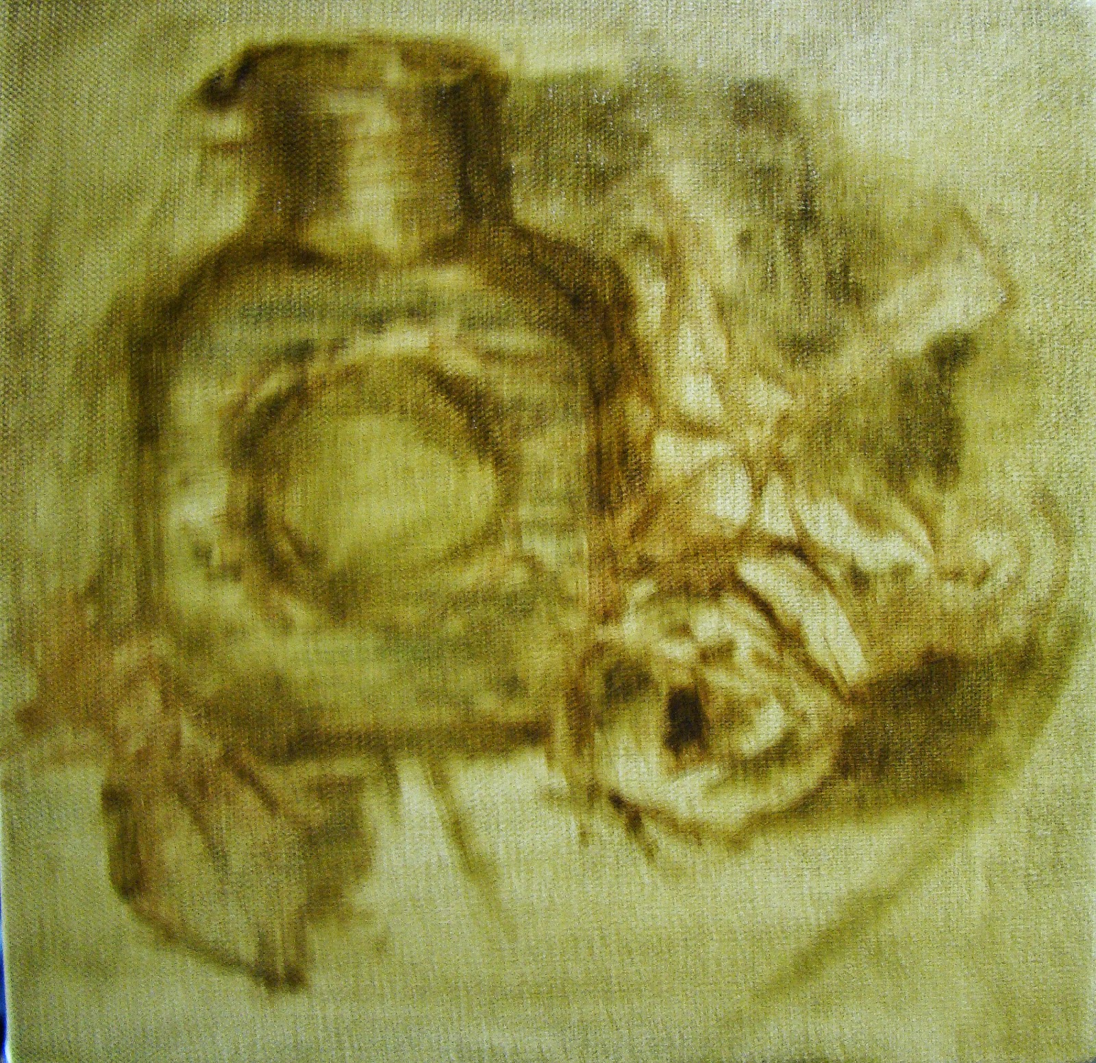 |
| Massing In |
The block in of masses only suggesting a few details to be sure I was going to stay with it. This took about an hour to decides what objects to use that I had laying around the studio. Nothing new, this process is the same as most any artist you might run into.
I do tone my canvas when working this way, and my palette is toned to approximately the same value making it easier to judge the mixtures.
 |
| Getting the canvas covered. |
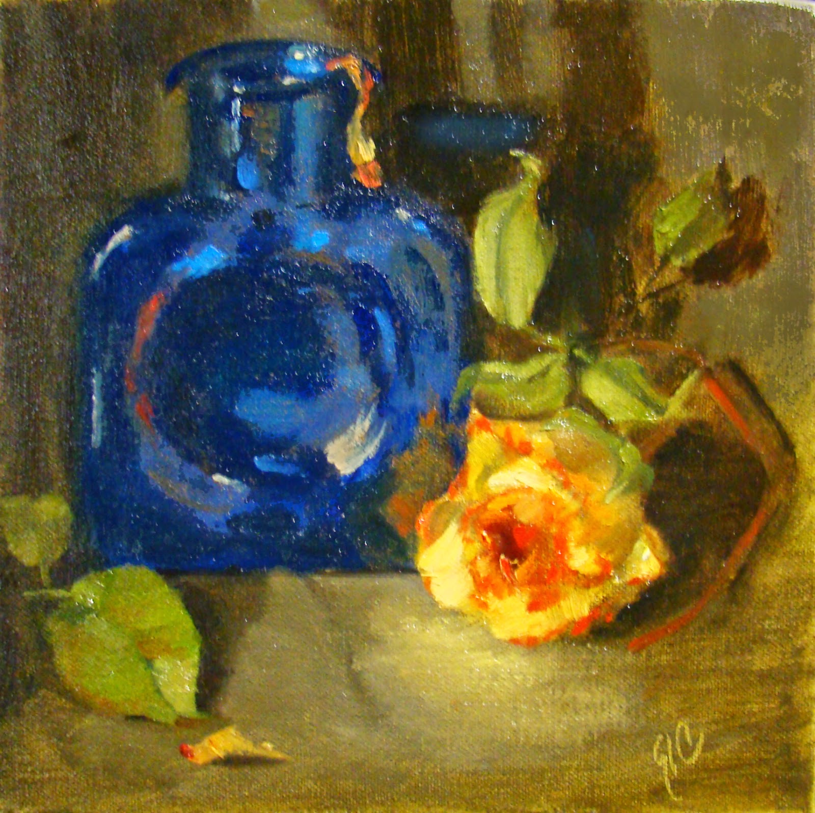
Then always working towards the finish and painting more slowly so I felt more confident about the value and color of each paint stroke. This took about 1.5 hours with a few breaks to judge what I was doing from a distance.
Looking in a mirror at the reverse to be sure it didn't look too 'wonky', and was really
content in the process.
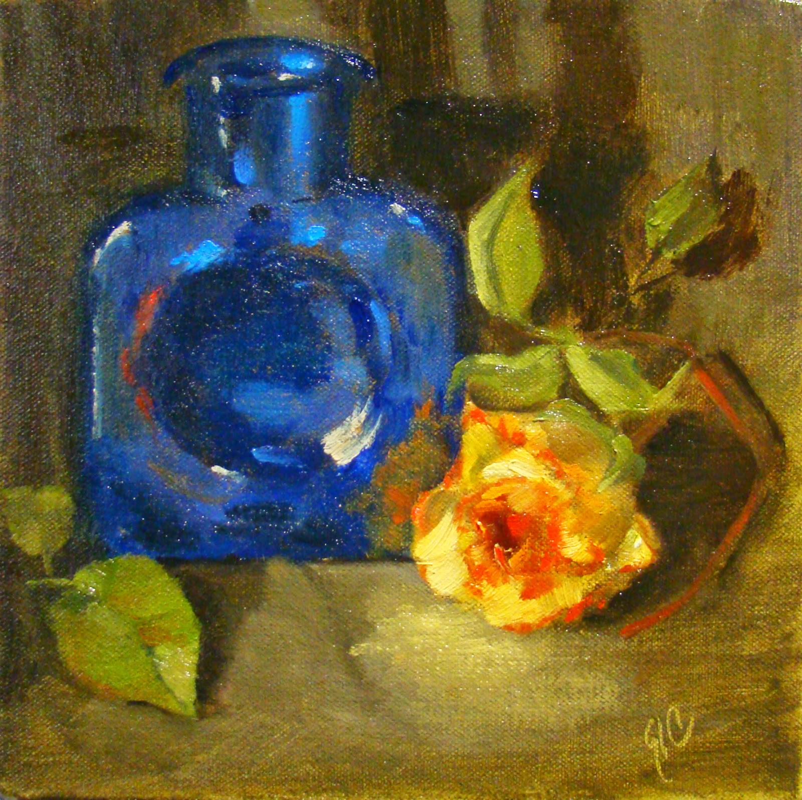
BTW, I wanted the rose to glow...
 |
Final Touches
8 x 8 Oil on Stretched Canvas
©2015 |
After about an hour I went back to see what I thought about the overall image and if it was worth keeping. I always do this and sometimes the answer is no and I'll scrape off everything and start over. This one though was going to survive another day. But (always the but)...
I wanted to do a few more touches to help the eye move through the painting so I added bits of orange peel, softened a few edges, and adjusted values and reflections in the blue bottle.
Note: the blue glass bottle is a darker value, less bluish, and less busy looking in the actual painting. Monitors and the online editors tend to change values even when the original photo is almost perfect.

