Sunday, April 26, 2015

Stylized Portrait of Angel for Daughter


I actually painted this a few weeks ago, but didn't post because it was a surprise for my daughter. (Ahem... Once a Mom always a Mom.) 

My (adult) daughter lost her kitty last year around Christmas time, and I know how difficult it was for her. The little painting made her smile...

I started the idea back in January, and finally had to accept that my photo reference was not all it could have been for a black kitty with a white chest. It was taken in flat lighting, and I just couldn't get any descriptive details from it so I had to settle on a stylized version.


Angel 
5 x 7 Oil on Canvas Panel
© 2015


Thursday, April 16, 2015

Copyright, Imitation, and Culture

What's your point of view on copyright laws and appropriation for your own artwork?  I know I do enjoy painting an occasional master copy, and find it very valuable to developing my own skills. I am not talking about something that crosses both a legal and ethical line like plagiarism.

I happened to find this thought provoking TEDtalk… on this very topic that presents an argument in favor of imitation.


Here's another interesting article discussing copyright protection of an entire culture!
http://lanfiles-vm.williams.edu/mbrown/Brown-CopyrightingcultureCA98.pdf

I have feelings in favor of both sides even with my own artwork and images. I know whenever I did a project for a corporate client in graphic design, it was a given that they owned the results, and I always felt okay with that arrangement. I often see my design work on the side of trucks and billboards even to this day (from some 12+ years ago) and have to admit I feel a little bit of pride in a good way that they are still using those images.

However, I tend to feel a different emotion when I do my fine art images… maybe it's because it is  more personal, but I would still see it as a compliment if someone likes it enough to copy it.

Tuesday, March 31, 2015

The Illusion of Space in Painting...


Here it is the end of March 2015, 1/4 of the year already behind us.
I recently challenged myself with the idea of conveying more space in my paintings. It came about because my daughter mentioned that some of the images I've done tend to look more dimensional than others so the analytical side kicked in to discover why - my left brain had something interesting to do that supports the right side!! Holistic brain functioning should keep it happy, don't ya think?

This image is still on the easel for ongoing work, and I will not say this grouping is the most beautiful I've ever done, but it did teach me something about texture, and the illusion of  'space'. One point being the background value in relation to the foreground.

It also taught me the importance of choosing the right objects to support the idea I wish to demonstrate as well. This is a great exercise, and so happy about the newly developed  understanding.

I will be adjusting the background, and the value relationships to the foreground. My focus on the texture of objects got me off track a little so will also soften up some edges.

Obviously, this point of view is halfway between eye level and looking down on the table top for a basic starting point so I will be adjusting the height of my table to be higher and/or lower for continued study of spacial relationships in a painting.

Untitled
9 x 12 Oil on Canvas Panel
© 2015


Wednesday, March 18, 2015

Mozart's Music - Health Benefits!

A little segue to another art form that is good for you! Like me, not everyone grows up on classical music, but I do still like to listen to it. Even better, it is now proven to help with memory and learning.

I can only think that more arts in the schools and everyday experience would truly enhance everyone's quality of life.

Classical Music’s Surprising Effect on Genes Vital to Memory and Learning

Enjoy!


Wednesday, March 04, 2015

Back to Oil Painting Basics...

During the past several weeks I've purged every thought/idea that popped into my head without judgment. Just hacking around. I had a blast doing that... however, I decided to get back to basics. The steps described may seem boring to some folks, but when you love something, it is also for the love of the process. 

I started my painting with an instructor (Ron Lukas - in Ballard, WA) back in the 80's. He was from the Russian Impressionist tradition. This study was after a 4 year degree in art. The painting interest has always been with me, but it was hard to find anyone in my area who could teach me the technical skills along with an intelligent understanding of what I was doing! Ron was better at teaching what I wanted to know so I studied with him for a couple years once a week in a group setting.

Ron would do demos at quite a fast pace, and I remember asking myself how does he do that? His brush strokes looked like jewels! I had no clue how he decided on color mixtures, because they clearly didn't match the objects he was painting. And so it goes for every clueless beginning student of painting...

First came the value studies in black and white that I still do to this day. I love it! ;o)
Then came some basic still life in color, and then painting from a live model. I thought everything looked ugly. ;o( Mixing color O-M-G what was I doing???

Filbert brushes are all I used... so I decided to just get back to basics that Ron taught me using a palette similar, but a little different... and a little more in the traditional style.

Massing In
The block in of masses only suggesting a few details to be sure I was going to stay with it. This took about an hour to decides what objects to use that I had laying around the studio. Nothing new, this process is the same as most any artist you might run into.

I do tone my canvas when working this way, and my palette is toned to approximately the same value making it easier to judge the mixtures.


Getting the canvas covered.
Then always working towards the finish and painting more slowly so I felt more confident about the value and color of each paint stroke. This took about 1.5 hours with a few breaks to judge what I was doing from a distance.

Looking in a mirror at the reverse to be sure it didn't look too 'wonky', and was really content in the process.

BTW, I wanted the rose to glow...


Final Touches
8 x 8 Oil on Stretched Canvas
©2015
After about an hour I went back to see what I thought about the overall image and if it was worth keeping. I always do this and sometimes the answer is no and I'll scrape off everything and start over. This one though was going to survive another day. But (always the but)...

I wanted to do a few more touches to help the eye move through the painting so I added bits of orange peel, softened a few edges, and adjusted values and reflections in the blue bottle.

Note: the blue glass bottle is a darker value, less bluish, and less busy looking in the actual painting. Monitors and the online editors tend to change values even when the original photo is almost perfect.

Wednesday, February 25, 2015

Developing Good Taste...

Developing good taste, as it applies to painting, is a topic foremost on my mind lately.

I've discovered that while I love to paint, applying the paint to the canvas in hopes of liking the result, I sometimes shake in my boots that I might never improve or reach the level I aspire towards. I know this state is common with artists, and hardly a matter of life and death in the strictest sense, but it is so important to me personally, that I will spend days thinking about it.

I'll ask myself if I've set my sights too high, or am I just setting myself up for failure? The only thing that settles me down is knowing I am willing to improve and change what is getting in the way of creating more successful paintings.

I often read articles like this one, or this one, to see if I can nail it down. I look at lots and lots of  images, and can clearly feel what resonates, and what feels off the mark to help me identify where my 'personal taste' fits into the big picture. Through my eyes it goes beyond what is pretty, and includes a measure of how a visual image communicates to me.

Along this journey, my intellectual understanding of the painting process is way ahead of my skills so my own work frequently misses the mark I'm shooting for, but I get that I won't improve if I don't paint.

Also knowing that I've picked up a lot of useless information that gets in the way really frustrates me, but the good part is - I am recognizing that this is happening.

There will be times the painting is acceptable for my skill level, and I save those to refer back to later - using it as a measuring tool for progress or not.

This most recent image is one of those images. It is actually several days of study, one bloom per day, trying different things with brushes, textures, and paint mixtures. The grouping was an afterthought so the composition feels awkward to me. If it looks thrown together void of well thought out design, you are correct. The lighting is only the over head bulb in my studio, and I made up some of the little flowers. Looking at it now, I think it could also use a little more greenery.

I was reluctant to post it, but courage is also a requirement for this process! ;o)

Rose Grouping NFS


Monday, February 16, 2015

Thoughts on the Structure of Roses... and Artificial Props

This week, I'm interested in a series roses, single blooms in various stages and colors to brighten my easel, and continue to work on values. It is sunny and warm for February here  in the NW, and roses are not yet blooming. So I decided to invest into some study time on the structure of roses. Why you may ask?

Well, I will be using artificial props, and there is something usually 'off' about them. It turns out that most real roses have 5 petals in each whorl, so if you are using artificial/silk blooms to study painting, this may not be what you will see. There are rose species that have 4 petals, but not many, and the number of whorls seems to vary as well.

The green 'thingys' that sit at the base of the bloom are called sepals, and match the number of petals in one whorl, and can be seen surrounding the bud. The sepals protect the buds, and later support the blooms.

The stamens produces pollen (male), and the pistil topped by the stigma (female part) is where the pollen is deposited.

At the end of the season, you might see rose hips, the fruit, depending on species. The actual leaves grow in groups, and I left off the thorns too. ;o)

If you would like more detail, the wikipedia can expand on this information, but for purposes of the artist learning to paint this beautiful flower, this short explanation should suffice and point you in the right direction when using artificial props.

I am not going for a photographic look just because I know the basic parts of the rose, but I think it helps to have some understanding of a painting subject. Both paintings are done on linen sheets.

The first is full bloom and clearly a value study. No mystery there, but with this particular silk prop, the petals are distinctly rolled over a bit as if it is wilted.

I decided to use a bright synthetic brush, size 12, to give a sharper edge to some of the petals rolled edges.

Rose Blk/Wht Study
© 2015

The smaller bloom below did not have the correct number of petals of a live rose, but went for it anyway, and hoped to give it the illusion of a natural rose. Knowing it should have 5 actually was helpful. Used various brushes on this one.

MidBloom Red Rose
© 2015
I have now added some new words to my vocabulary, and I don't have to say 'thingy' anymore when talking about roses!

Thanks for reading and hope this helps if you also need to use artificial props.

Monday, February 09, 2015

Fractured Pear and White Berries

During the January 30/30 Challenge I attempted a process called fracturing and painted an image called Fractured Apple. I thought I'd try again because of experiencing an interesting sense of creativity that was loose and somewhat abstract while exploring the process.

So here is the second attempt to play with this process, and I experienced the same feeling in the process. The only changes were the pear and the berries.

Fractured Pear and White Berries
Oil on Linen Sheet 9 x 9
© 2015

After looking at this for a couple days now, I think I see this process as a metaphor for creativity because out of the chaos on the surface markings there is still an order to the image. It feels expressive and freeing to do something like this after so many years of more formal efforts.

Wednesday, February 04, 2015

Watts Holiday Relay Portrait Painting

I posted this activity from last year and glad to find it is a yearly activity/celebration!
All these portrait painters must be equally skilled at a very high level to pull this off so successfully! Enjoy!!

Watts Holiday Relay Portrait Painting


Time to get back to my easel...

Friday, January 30, 2015

30/30 Challenge-Fractured Apple-Day 30

We made it!! This month's challenge for 30 days of painting has been eye opening for me. It was like clearing out all the random thoughts and ideas that have been floating around in my head by doing exercises, and experiments without any worry about the results. Only goal was to search and learn from each painting session. You could say it was simple brainstorming much like a writer might do all the while searching for a 'story' to develop.

One extra activity I finally had time to do is watch the Julie Ford Oliver instructional videos on Daily Paintworks... it is a very creative and intuitive process she calls fracturing, and I couldn't think of a better time to explore her technique.

Day 30

Fractured Apple and Blue Berries
Oil on Linen Sheet 9 x 9
© 2015
I started with apples at the beginning of the 30/30 Challenge, so I thought I'd finish up with an apple using the fractured technique. It's a first attempt, and the only things I changed was substituting the squeegee with a rubber angle tipped shaper/wipe out tool that was already in my supplies, but will definitely make the kind Julie recommends in the near future. I also don't have as much layering, was afraid it would go muddy.

It was great fun to try! You should check out Julie's work to appreciate the potential!

Thank you all for visiting, reading and commenting on this 30/30 Day Challenge. Hope this record of my experience has brought some insight and ideas for your work too.

Thursday, January 29, 2015

30/30 Challenge - Angel - Day 29

During this 30/30 Challenge my own subject matter has been all over the place from indoor studio still life, portrait from life, and landscape. Included rendering same subject matter from photos to reinforce how differently the colors are represented. Certainly not a body of work for gallery representation, but what a pleasure to just play and experiment. I've learned that I love to paint anything and everything.

After the end of the challenge, I'll narrow it down and select a few things to concentrate on for awhile. Since so many questions have come up while working on certain subjects, I'll be quite busy with my journal too.

Questions that you might also be asking are:
Why do I paint? Why this subject?
Is it a big idea or just something to practice craft?
What's my real motive - self fulfillment, therapy, money, etc.?
Is the idea related to art concepts or just a copy of something sitting on a shelf?
Does each start have an intention? What is a successful painting?
Is this one better or worse than the last one? Am I making any progress at all????
Many more...

Day 29

My daughter's kitty, named Angel, went to kitty heaven recently, and I thought I'd do a little study for her. Finding a good photo wasn't easy, but notice the double heart shape on her chest fur-so cute!?

One of my personal goals was to start something new everyday, have to say, I came close. Only a couple were longer projects, but there was a reason behind the shift in the plan - mostly because I was trying slightly different things in one painting each day.

Since I'll be headed to a meeting, this will be one of several starts to be finish after the challenge this month.

Wednesday, January 28, 2015

30/30 Challenge - Ballerina - Day 28

My favorite models are dancers. They have a sense of movement and body control that most other folks are missing. There is such a beautiful sensibility that is so expressive. Whether they are sitting down, or expressing in dance.

If you love to draw and paint the figure, I hope you have the opportunity to study from life. It is the absolute best way to learn how, and you can see and learn how others approach the subject.

Day 28

This little study was from a photo lying around my studio and thought it might be worth doing a loose value study using the color of linen as the mid tone and adding the highlights and dark tones to describe the dancer.

Time to begin Days 29 and 30.

30/30 Challenge - PK Landscape -Day 27

I wanted to get back to working with the palette knife again on a landscape. It produces a sculptural quality that seems to fit with landscape images. It's messy and textural, and if you love oil paint, it just satisfies the senses and my right brain loves it.

In addition to knowing it would take a lot of good practice to get this technique working successfully, just going for it gets rid of the tendencies of being too fussy. The expectation is different.

Day 27

Monday, January 26, 2015

30/30 Challenge - Roses - Day 25-26

I've had these silk variegated roses sitting in a pale for at least 3 years, and everytime I think about painting them I resist. It looked like an overwhelming task and I'd tell myself to wait until my skills were better. Well I don't know that my skills are better, but I decided to take them on.

I think I got some courage from something I read about how to approach mixing a desired color. I was taught to 'paint what I see', but I always saw what I couldn't paint because of the limits of paint. Nothing as bright as the sun, and nothing as dark and a black hole...
I never really learned how to actually mix a desired color and wasted lots of paint and failed continuously trying to achieve what I was looking for...

Well recently I read that when looking at a setup, identify the color (keep it simple), red, blue, yellow, etc. Don't try to say orangey grayish purple or some other impossible hue that's clearly not on your palette! So after identifying the hue, then mix for the value of that simple color, and also adjust for temperature... and finally adjust for chroma.

Day 25

I wanted to take time to give this new approach some time since I'm usually just guessing what to do with the mixes. I laid in transparent color to start and identified the light and dark areas of the roses.

This took a bit of time, but I let it sit overnight before making more difficult decisions about color. I did some practice on my palette to be sure I could remember the sequence of mixing.

I was putting in a warm background for contrast to the cooler color in the setup. It's all relative... right?


Day 26

The exercise was not as difficult as I imagined. Could maybe adjust a few more things, but my goal was to try the mixing approach.

I have some practice to do, but this effort using the above approach resulted in colors that I was fairly happy with... after all these are variegated silk roses unlikely to ever be seen in nature!

I will attempt again soon and give a little more attention to the composition and light source for stronger shadow pattern.

Thanks for visiting...

Saturday, January 24, 2015

30/30 Challenge - Madalyn Start - Day 24

I've been wanting to paint a photo of my granddaughter for literally years! I misplaced it about 5 years ago, and searched for it countless times with no success... 'sigh'

Finally, while just goofing around in a stack of colored paper, and 'what not', it popped up! I was so pleased - in fact, thrilled that it hadn't been destroyed?

Now it's duplicated and stored in a safe place... and I can start the painting process. She's older now, but I just love this pose of her and can hardly wait to finish it to hang on the wall.

Day 24 


Worked out a few sketches for value patterns, and just had to lay down a oil sketch before doing anything else. I will do a few more studies, but wanted to share this with you now.

Doesn't she look like an 'adorable baby doll'?

Thanks for visiting...


30/30 Challenge - Value Study - Day 23

I believe a big part of learning to paint is also doing activities that help solve potential problems that we encounter when a master/mentor isn't available to give us feedback. It's what we call 'study', but we of course we must be able to recognize what we need to improve without just being critical of our work. Since I know I still have the challenge of nailing values in color when doing a mix, I chose to work on that today...

Day 23


This setup is pretty quirky, not meant to be beautiful in any way, and I almost never select items with hard edges because I don't have a real steady hand or good tool for defining them except for a palette knife. However, since I have these blocks left over from my granddaughter's stash, I just set them up and lit them from the side. The little squash is almost ready for the trash, and thought it would put strong contrast into the painting.

I chose a setup with five distinct colors of different values. Didn't use black and white for the paint, rather UMB and TOR and white to change values. This way I still have some sense of color as I mix a value range. Then for your convenience, I painted swatches of the local color/shadow color of each item in the setup.

This is the result... can you tell what color is what value?


Thursday, January 22, 2015

30/30 Challenge - Huge Solitary Lemon - Day 21-22

Well, it's now day 21 and I'm still on track. Have to say that I've been feeling a little bit of resistance mostly because I want to put more time planning before starting a painting, but if I've established a new habit of painting everyday, then I won't feel defeated no matter what the outcome. The daily posting to the hosting blog is probably the most challenging to accomplish in this exercise because of the time limit on when posting is closed for any given day.

Day 21

Why this lemon?? Well, I've seen a lot of lemons, but none the size of a large orange!! This has to be the largest lemon ever - it's skin wasn't smooth and yet it wasn't very thick either. Just seems so unusual, but then I don't get to see them growing in their natural environment. Never the less, it wanted to be painted, right?

Once again with reflected light. The light source is again at the top, like high noon. I'm trying to keep most things consistent to see if I notice the color nuances more easily with fewer variables except for the main object.


Day 22

Decided to paint this record breaking lemon again with another light angle so I didn't get the halo effect on the table top-and a few minor changes in the setup. Lemon turned, changed the color of the table top, and added some greenery.

Still working on reflected lighting which is a huge challenge for me, but lots of fun trying. Also limited the time to complete so I don't think so much about the decisions.

Tip: This may seem obvious to you, but it wasn't readily apparent to me. The metaphor that comes to mind here is I 'couldn't see the forest for the trees.' Even when I squint, I've found that I'm noticing too much information when I begin a painting so I've decided to work with a setup from a greater distance so I don't see so much detail. If I need to see some more specific detail, I'll just walk up closer to see it. I think this will certainly help me see larger shapes first...

Tuesday, January 20, 2015

30/30 Challenge - Solitary Onion - Day 20

We (meaning all the participants in the challenge) are two-thirds of the way complete!!
I must say, I am feeling several emotions ranging from panic to relief that we are on the home stretch... just 10 more days to create/paint something and get it posted. I've learned more than a few things about myself and the painting process.

So for today, it's a solitary onion that sprouted after sitting in the studio for weeks! Nothing about the materials changed except I used Senso clear acrylic primed canvas.

Day 20

Didn't make much fuss - just wanted to paint what I saw paying particular attention to reflected light. I plan to work with this idea in the future and consider the direct light, the reflected light, as well as the ambient light. There really is a difference and especially noticeable when working with 'whitish' objects. I will be more deliberate about setting things up next time I work on this idea.

The background in this photo shows more color intensity than the actual painting. I'm thinking my camera may need some adjusting, as well as figuring out a fool-proof way to get rid of the darn glare.

Since, I'm tired and hungry right now, I'm calling it a wrap!!


30/30 Challenge - Solitary Rose - Days 17-18-19

I decided to tackle something a little sweeter smelling after the experience from the last few days!

What better than a Rose? Roses are one of the most beautiful flowers (my other favorite is the peony), but I find them challenging because of all the intricate details. They have a lot of color shapes and values within the overall shape which can make them seem too complicated to tackle. I found however, that if you can describe the main perimeter shape and the main basic interior shape, they are much easier to handle... and remember it isn't necessary to paint each and every little detail unless that is your painting style.

Day 17 

If you read my blog from Day 16, you will perhaps understand why I chose this paint subject and why it is only started. Nevertheless, I am still painting each day, and that's a very good thing.

Materials are acrylic primed linen sheet and my usual bristle brushes and color palette. The rose is and off-white silk type, and while it has a softer look that a real freshly picked bloom, it won't wilt on me while I'm getting my time schedule back on track. It is sitting in the little purple box with glass for reflections.

Wishing myself more time tomorrow to complete!

Day 18

I was working on this while the Seahawks game was on, so that blew the 'more time' idea. If you didn't see it, it was quite an amazing game with the adrenaline in overdrive; the Seahawks won the game in overtime after being behind for a good portion of the game! They are going to the Super Bowl!! I think in all the excitement, I got a little heavy handed. The paint is thicker in places it should be thinner and I was confusing the values. Maybe work with fewer values in the painting even if I see more in the set up. Some of the color also seems too intense. I'm not yet satisfied with the reflection either.

With this many areas in question, it might be a good idea, to scrape down and adjust. The lesson here, again, is to simplify.


Day 19

Day three on one small painting is my methodical brain going full tilt! After posterizing the first painting image in photoshop to simplify the image with fewer values and see what/where would work. This process isn't completely fool proof, but it is another way of evaluating what you've done.

Using the converted image with other judgments (the result of course is still judgment/opinion).

I didn't scrape everything before I started making changes, alas, I started to notice a few other things that I could do!


So this is the end result and time to move on... you may not be able to see the subtle changes, but one TIP to share is that the angle of the flower can make a difference on the complexity of what your painting. I'll be exploring this idea further in the very near future, and may do a black and white study in painting first using only 5 values to see how it translates from that... it may sound funny to some of you, but I'm really having fun training my eye to values - sooooo important in painting!

Thanks for reading...

Saturday, January 17, 2015

30/30 Challenge-One of Those 'DogGone' Days-Day 16

I hope you'll for give the following entry, but I had some stinkin' issues to work out!

Day 16 

Izzy ©2015
I'm sure you've had one of those mornings when the unexpected throws off the entire day's plan... and believe me, I have had a couple of strange days causing a lot of  interruption to my painting time...

My sweet dog Izzy, got into the cat's food. I use one of those automatic feeders because the cat is an all-day nibbler. To continue, Izzy has a real problem with food and controlling herself when it comes to anything edible. She usually isn't alone near the cat food long enough to get away with this, and I'm not quite sure how much cat food she actually consumed, but it left its mark.

As you might imagine, it took awhile to clean things up, but she is much better now and things are getting back to normal. I will warn you though, cat food isn't just richer than dog food, it is down right TOXIC to some dogs so be watchful if you have a mixed household.

This painting isn't finished as you see, but it did help me work out my upset with Izzy... does she look remorseful enough to be forgiven?


Wednesday, January 14, 2015

30/30 Challenge - Painting Systems - Day 11-14

All beginning painters want to know how to begin, how to proceed, how to paint an eye, and how to know when a painting is finished... of course we all learn there is no one right answer.

However, this gave me an idea - I've never tried doing a step by step painting using a 'system' that would give successful results, but thought I'd give it a shot because of limited time, and just curious. I'm still in my experimental stage with the 30/30 Challenge, so let's see what using preplanned decisions on the steps towards doing a painting in a way that could be considered as 'following a system.' This will be done in layers and with limited time for each step of 1 - 1-1/2 hours.

BTW, the subject of this painting belongs to some dear friends of mine who have a 35 acre property close by my home, and it is one of my favorite places to hang out when I need some 'farm time'. This image is a composite of 3 resource images taken at their property, and taken on a sunny day.

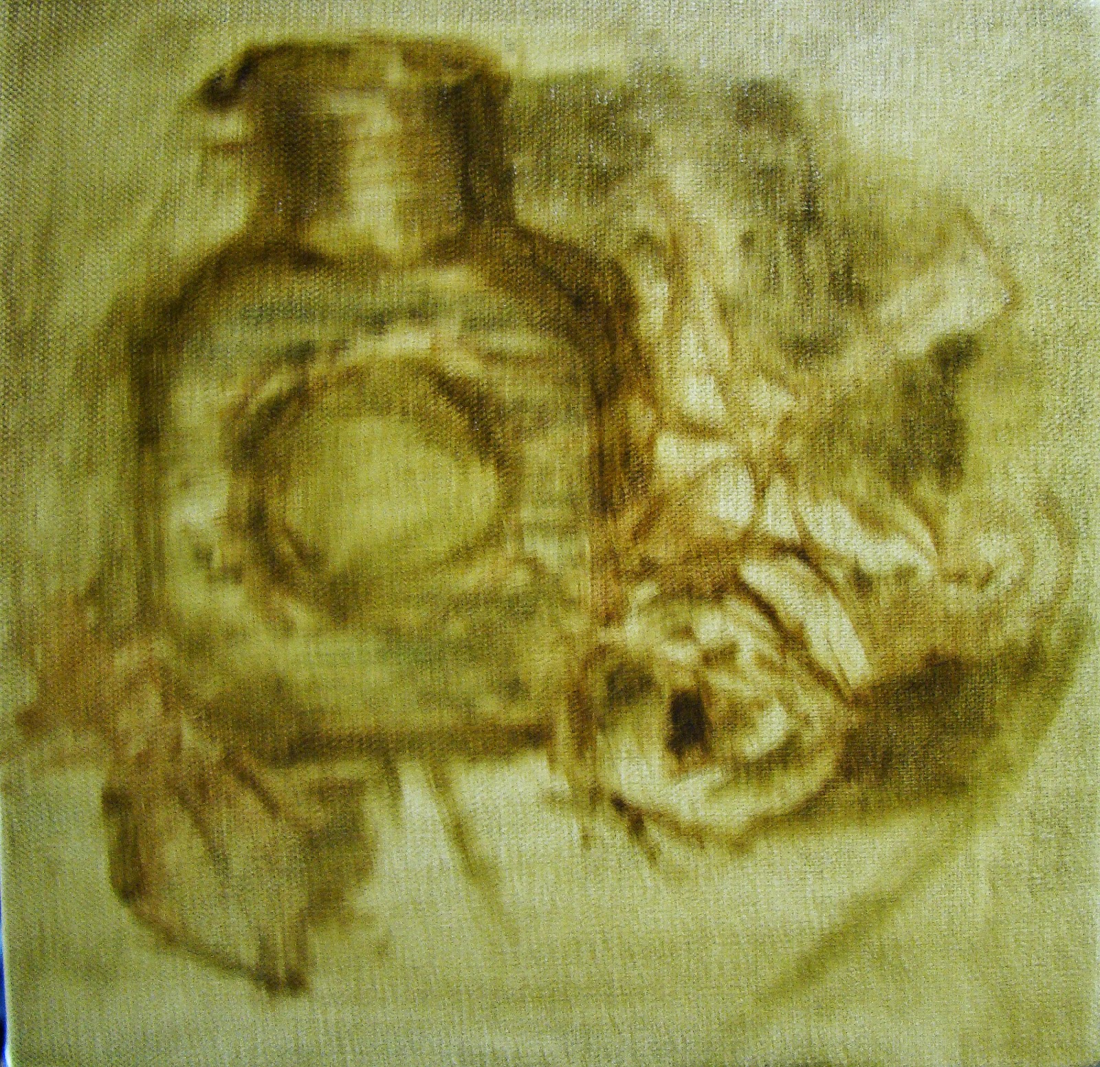
Day 11 - Step One: Initial Drawing Composition 

The drawing stage is how I was initially trained to begin a painting. It is not how I always start a painting, because often using masses first is better and freer way to work. However, let's go with drawing in the composition first.

The Barn is taken from one photo, the outbuildings from another, and the field with the road a third. Using a mid-toned linen, only a round synthetic brush, and TransOxideRed, and Ultramarine blue paints. That what I used to start this painting.

In my head I thought that each element that I selected might give a sense of space and also a good lead in to the painting. The materials would be attainable for most anyone's budget.

Day 12 - Step Two: Paint in the Big Flat Shapes of Local Color

This is straight forward because most anyone can identify the local color of an object, but gets a little tricky when trying to see the shadow areas.

I used one flat bristle brush and my current palette of colors mentioned in yesterday's post.

The paint layers are thinner in some areas that still show the canvas, and other areas that have a heavier cover. This was mostly done subconsciously, but the lighter value areas often mixed color with opaque white usually covers more.


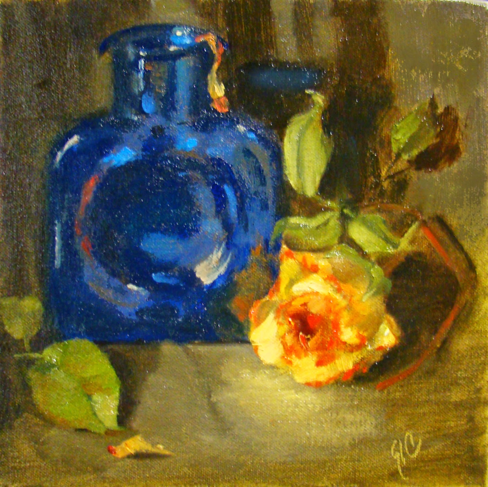
Day 13 - Step Three: Paint with Heavier Layers and Adjust the Values

Something I haven't done before is to try painting with only a palette knife, so I decided this layer would be done that way. I also used a rubber wipeout tool. NO brushes today.

It wasn't easy to keep to this plan, but I did, and think there are some good results. Nevertheless, it was worth trying because I learned more about handling a palette knife and have a better sense of when it might be best to use one. A palette knife remember gives a more sculptural feel to the paint in general (unless you are scraping off), and sometimes it is really effective. Yummmy, thick oil paint can be sooo beautiful when done well.

The biggest and most frustrating challenge with using only a palette knife was trying to handle the details! Looking forward to the freedom tomorrow to use any tool I want  to correct some drawing errors, and going for the finish!!

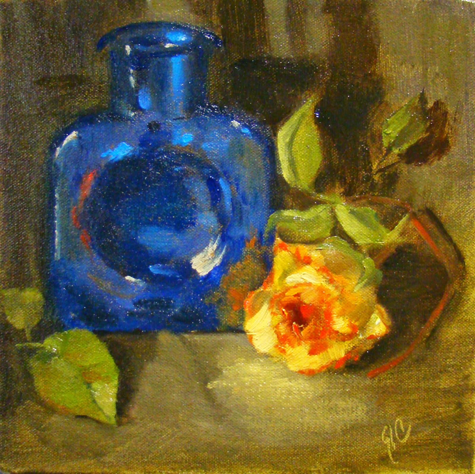
Day 14 - Step Four: Finish and move on...

Tools today included anything even my fingers, and had the urge to scrap things away when I first approached the easel. Decided to follow through with the idea of using a 'system of sorts' and simply  resolved that this is all I will do with this effort other than revisit the results as a reminder of the experience.

Was a bit short on time for the finish, and found I wanted to start again using a horizontal format and not limit my approach as in this exercise. Most importantly after doing this exercise, the final lesson is that whether you begin with drawing, laying in masses, wiping out, etc., each painting image requires a little different approach rather than following a 'painting system'. That is an approach I can live with!

Once again, I hope this little exercise, including my humble 'opinion', will be helpful and save you some time as you move forward with your painting.

Saturday, January 10, 2015

30/30 Challenge - A Change Coming On - Day 10

WOW! This 30/30 Challenge is 1/3 complete!
Have to say it has been a great experience so far, and am mostly able to get this accomplished because of fewer unwanted distractions in my life. Yay!!!

Day 10

This little painting includes some changes on my palette.

After doing some preliminary mixing to test some combinations, I removed the Prussian blue, and will be using Manganese blue instead and will allow for some substitutions.
(The substitutions are so I can use up some of the tubes in my collection of paints.)
© 2015 - Manganese

My palette now has Cad Yellow Light (interchange with lemon yellow), Indian Yellow, Cad Scarlet (interchange with Pyrol Red or cad red light), Quinacridone Magenta (interchange with Alizarin Crimson or Permanent Rose), Ultramarine blue (as usual), and the Manganese blue (interchange with Cerulean blue or possibly Sevres blue). I will also include Yellow Ochre and Transparent Red Oxide and White (will be trying variations of this too). There may be occasion that I'll use a touch of Ivory Black because when mixed with yellows it makes some interesting greens.

To review these first ten days...
Setting a time limit for working on a study... this is good sometimes, and not so good
at other times. If I want to measure to see where I am with my sight skills, it's a good thing. However, if I want to learn something while exploring the possibilities of technique, then 'no thanks'; that's when I want to stand at that easel for as long as it takes for me to get my 'aha moment'.
© 2015 Grayscale
Values are starting to recording more easily when looking at color. Still do not get it the first time everytime, but with practice it does get easier.
© 2015 - Desaturate
Tip: Try using 'de-saturate' when converting to check for values, also use 'grayscale' to check for values - see which is more faithful to the information of the various steps. If you like, you can also use 'posterize' to flatten the value shapes and see if it relates to the way you first put down your basic value shapes before the details.

© 2015 - Posterized

Materials always seem to be changing to fit the desired end result. With this in mind, and after using a variety of canvas types, brush types, and colors, I am learning my preferences, and as a result, more of the preliminary thinking is taking care of itself. This is a plus and HUGE time saver.

Working Without Judgement is so liberating. No pressure, no feeling like I have to perform in a particular way... I can explore the what ifs, and claim the discoveries as my own, even if someone else has already figured it out. I must encourage you to take at least a few hours each week to do something similar. There will be no failure; only a lesson learned!

And finally the Changes I decide to make on my palette or choice of brushes and ground for painting are based on a real understanding of what the heck I'm doing and why. This is a priceless place to be...  I so appreciate my past instructors for giving me the boost to get started (a future blog topic), and yet to make a choice for this process selecting what materials, and exploring the technique is the most honest way for me to work!

A huge thanks to the readers with me on this 30/30 challenge. This first 10 days, I hope have been helpful to you in some way too.

Friday, January 09, 2015

30/30 Challenge - Ideas w/o Judgment Days 7-9

These small studies are using prussian blue as the blue on my palette. It is soooooo strong, but thought it would be worth it to have first hand experience using it.

I like transparent colors alot and Prussian blue is very much transparent. Also used Indian Yellow, and a mix of cad scarlet and permanent alizarin crimson for the three colors on my palette along with white.

I learned that while each of these is a beautiful color, the mixes are more difficult to control with the tinting strength being so different for each. Nevertheless, it was worth the exercise.

Also tried a few 'scratchy' things and props that I have not used in the past, and still limited the time worked on each painting as before - one to one and one half hours.

Day 7

Another apple day. This was done inside a dark purple box with light peeking in. I wanted to keep the colors strong and just went for it. Because the light was so cool, I decided to add TROxide for the darker shadow areas.

Used a piece of glass on the bottom for reflections which gave a bluish color to the area. Love doing reflections. This reflection is stronger than it maybe should be, but like the blue contrast with the reds and yellow in the apple. Also used the end of my paintbrush to scratch lines into the paint. No particular reason except to just act on the ideas that are spontaneously surfacing in this process.

I'd like to comment a bit further on this because it has been liberating. I haven't really tried to do a masterpiece on any of these small paintings, the only requirement is that I paint everyday and brainstorm ideas without any judgment. It's similar to how writers might get started. If you journal, this same process helps get all the crazy stuff out, and sometimes it allows some really good stuff to surface!! Really a fun and interesting way to work... try it!

Day 8

A pear day. Today's exercise was to use less saturated color everywhere except the main subject. Again with the reflection, and recording a simple impression of the pear.

Still just going with any thoughts and ideas that surfaced to see how much my subconscious was engaged. Same color palette and purple box, but as I mentioned was going for less saturated color.

Also tried another brand of round brush which seemed about the same as the other one, except it was more 'bendy' with longer hairs. And my usual bristle...


Day 9

Same apple (you can tell by the yellow spot), but with a plastic green bag used when it was purchased, and still setup in the same small purple box.

Worked on value, more than trying to match color for the surroundings. That plastic bag was no easy task with all the little facets. It would take considerably more time to get it more defined. Remember, I was not trying to get each little facet rendered, only the illusion, and only in about an hour's time. BTW, this poor apple is no longer edible! ;o(

Finally, what I can say about Prussian blue is it is beautiful and challenging to use, but worth the effort.


Sunday, January 04, 2015

30/30 Challenge - Values - Days 1 thru 3

I decided to join this challenge (30/30 Day Challenge) to re-inforce my determination to paint more in 2015... my posts won't be daily, to ensure I do not spend too much time posting more than necessary; and it might make for more interesting reading.

I will likely be posting unfinished paintings along with some that may get to the finished stage. My main goal is to paint or draw each day, but also will use this as a study tool and working on various elements in art. Will also be exploring materials.

These first were each given a short time with the idea of translating them later into B/W images to check my values. As you may already know, seeing correct values in colored paint is one of the biggest obstacles a painter faces. This is one exercise that I'll be repeating in various subjects to see if it makes a difference on how I see the values.

I know the reader will be at a disadvantage not able to see things in person, and there is some undesirable glare from the lighting - but here we go... and hopefully it will give you some ideas to work on too.

Subject: Values/Apples - keeping things basic to start.

Day 1
Using lighter a background to see if I can still pull off the value relationships. I do see the relationships and think maybe the values could be pushed a bit more... The light I used on the setup wasn't very strong light so this is about right and true to what was there. The halo around the shadow was actually there...


I think these apples have more detail than I needed to show.
 
Day 2
Once again with the apples... about the same today. I remember that nothing in shadow should be as light as the area(s) in the light. Since I used a light background, it will be a bit more difficult to follow this rule.


Less detail, and notice the yellowish spot doesn't show separately
from the red shadow area.

Day 3
Third try on the apples with the same setup including the lower lighting. Hmmm... except for the highlights, the background is still picking up more light than the rule would suggest.  Now, I really do wonder about that rule... will try apples again later in the month with a stronger lamp to see if it makes a difference. My thoughts are that this rule applies with each object, and not necessarily all object collectively in the entire painting.


NEXT comes playing around... ever wonder what to do with all those studies that will never be sold and likely tossed in the garbage in the very near future? How about wallpaper or quilting pattern ideas!  ;o)

© 2015