Showing posts with label oil on canvas panel. Show all posts

Saturday, December 03, 2022

Pink Hydrangeas and Porcelain Cup Oil Painting

 Pink Hydrangeas and Porcelain Cup - Intense Color

I grew up with Blue Hydrangeas and thought that was their only color. Things have changed, and Pink Hydrangeas seem to be leading the way lately. Went to my favorite nursery and could not find one blue version of the beautiful flower. I miss the blues, but decided to try pink. Such a warm painting will require a warm frame!

I love painting flowers, but they are one of the most challenging subjects because when you look close there is so much detail. The challenging part for me is editing the details. Since I'm not a hyper realism painter, I enjoy a looser style and prefer to suggest some things letting the viewer fill in with their perceptions while still keeping a bit more detail in the focal areas.


Pink Hydrangeas and Porcelain Cup
8 x 10 Oil Painting ©2020
 
Always check the values:

BW - Pink Hydrangeas and Porcelain Cup
8 x 10 Oil Painting ©2020


Thanks for checking in.


Wednesday, September 21, 2016

Throwback Mannequin - Oil Painting

Why Throwback Mannequin? Well, it reminds me of the 70's! Gold and Avocado Green.
Another gem found at the Goodwill store that I couldn't resist!

Throwback Mannequin
6 x 8 Oil on Canvas Panel

© 2016


Saturday, September 17, 2016

Poppies Maybe - Oil Painting

Found the little brass pot at the Goodwill. It's one of my favorite places to scout for still life items. This composition is becoming one of my favorite formats. Enjoy!

Brassy Poppies
5 x 7 Oil on Canvas Panel
Purchase Price $49.01
© 2016
SOLD

Wednesday, September 14, 2016

Lazy Orchid Blooms - Oil Painting

One of those subjects that just seemed to call out "paint me like this." If you decide to frame it, a warm colored frame (not black) does the most justice to the colors in this painting. If not, a table top easel works too!

Lazy Orchid Blooms
8 x 6 Oil on Canvas Panel
© 2016


Monday, September 12, 2016

A Little Mantel Piece - Oil Painting

This was one of those subjects pulled from things just sitting around the house. The hydrangea do not  always dry in a way that is pleasing, but I found a few heads that should find their way into future paintings.

Hydrangeas in Copper
5 x 5 Oil on Canvas Panel
Starting Bid $39.01
© 2016

Can be purchased at Auburn Creative Arts Center

Monday, September 05, 2016

Indian Corn Oil Painting

Here is an Autumn Themed painting that is for sale on Daily Paintworks.

I usually start with pumpkins this time of year, but liked the idea of painting these colorful corn cobs.
Challenging to arrange the cobs for color and deciding how many kernels to paint!! Lots of fun!


Indian Corn
9 x 7 Oil on Canvas Panel


Sunday, April 26, 2015

Stylized Portrait of Angel for Daughter


I actually painted this a few weeks ago, but didn't post because it was a surprise for my daughter. (Ahem... Once a Mom always a Mom.) 

My (adult) daughter lost her kitty last year around Christmas time, and I know how difficult it was for her. The little painting made her smile...

I started the idea back in January, and finally had to accept that my photo reference was not all it could have been for a black kitty with a white chest. It was taken in flat lighting, and I just couldn't get any descriptive details from it so I had to settle on a stylized version.


Angel 
5 x 7 Oil on Canvas Panel
© 2015


Wednesday, December 31, 2014

Onion Crossing Still Life

This is the last painting for 2014.

It's time to cook these darn things, but they served me well for painting this month. This one has lots of texture in the entire painting, even the onions. Instead of using a texture medium, I used paint that had a lot of oil removed which made it easy to get this look.
It's a different color harmony than I usually do, but I think it's okay.

The one thing I noticed was that the shadows all seemed to be a different color when I was painting it, and it shows here in the photo too. Not sure if my eye was making it up, or if it was really that way, or maybe was just a strange angle on the lamp. I won't be surprised if I end up fussing with it a bit. 

Onion Crossing 9 x 12 Oil on Canvas Panel
© 2014

Happy New Year!!!


Monday, December 15, 2014

Onion Basket Oil Painting

Onions were the first food I ever attempted to draw, or paint. The shape, papery layers, and color variety are just perfectly tempting for oil painting.

Tried several variations on the arrangement before settling on this one. Wanted to work on looser brushwork and textural forms, and thought more variety would keep me from over focusing. Lots of different textures with glass, fabric, smoothness of onions, and roughness of the basket.

While finishing up with this painting, I had an 'aha moment' about selecting a visual idea for any painting; keeping the concept in mind while working on the painting, can be the real challenge.


Onion Basket
16 x 8 Oil on Canvas Panel
© 2014
Will post another onion piece soon still on the easel with less textural elements. Yikes, also running out of time to do an Xmas painting. Better get going... still catching up from my trip to Hawaii!! ;o)

Thanks for looking!

Friday, December 12, 2014

Something about lemons and oil painting...

I don't know why exactly, but lemons are one of the prettiest things to paint. The light and shadow temperatures are easy to see, and harmonize so nicely. I don't even think about the sour pucker power they stimulate at other times. In painting, they just seem beautiful, fresh, and sunny. Must be the color, texture, and smell that I enjoy.

Was working towards a higher keyed painting with this couple... loved the extra little blossom too. Computer insisted on making the background more blue than aqua, but the painting looks quite nice in a gold frame. Might have to hang this one for myself.

Blossom between Two Lemons
8 x 6 Oil on Canvas Panel
® 2014

Wednesday, December 10, 2014

Pumpkin Oil Painting

I know, I know, It's been awhile...  since I last posted anything. Not because I didn't think about it, but I was quite occupied with many other activities. During that time, I even retired from Real Estate and went to Hawaii for a week! Completely unplanned, but a most needed break.
No computer, very little telephone, very little TV and all the other distractions that work life can bring. Loved spending time with my daughter and granddaughter. Helped put things in perspective, Oh yeah!

Anyway, I have a painting or two that havn't been posted yet. Partly because they were not finished. In fact, this one still needs to be signed.

I try to do one fall pumpkin painting each year. It seems a good measure of how my skills and materials are getting along together! ;o) So much to learn, so much to improve...
Eventually, when I do one I can reproduce for a seasons card series, I'll let you know!

Pumpkin in Blues
8 x 16 Oil on Canvas
© 2014/Fall
Call for Price


This painting was on the easel for quite awhile... a few changes here and there. I want to thank the critique group for their feedback too. That single blue petal decided the finish.
Need the signature now... and then the varnish.

Thanks for looking!

Saturday, October 26, 2013

Turban Squash - Still Life

This was getting back to my usual palette - and all I can say is what a difference. It shouts in comparison. Lots of fun to paint. Could end up in the oven...


Turban Squash - SOLD
6 x 6 Oil on Canvas Panel
© 2013

Tuesday, October 15, 2013

Still Life - Footstool w/ Book

Well I proceeded with the still life I began a few days ago and this is the current result... whether I toss it or make some changes is yet to be determined.

In any case, my intent was to follow through with this effort... it's more like a quick study illustration to me than a 'beautiful painting'.

The charcoal drawing in the previous post had more drama even with the compositional challenges. What I love tho is the shadow of the candle stick on the left - the distortion is interesting.


Footstool w/ Book
9 x 7 Oil on Canvas Board
© 2013
I used the adapted Zorn palette again. I think the flower could be smaller, and the wine glass seems too busy. Those would be the main changes I would make with this. A more simple wine glass without all the faceted cuts that catch the light in strange ways. I'll also adjust the shadow color under the left side of the footstool.
 **********

2 hours later: could not leave it for tomorrow... had to make a few changes today - here's the result. Less detail in the wine glass/check! Slightly smaller flower/check! If I ever start another from scratch, I'd make it a bud instead of full bloom. Little darker in left side shadow under the footstool/check! Now I can do something else!

Revised Image
**********

Several Days Later: had a change of mind on the  tone of the green foot stool. It seemed to be competing with the flower.


Revised Image 2


Monday, September 30, 2013

Still Life - Blue Poppies with Yellow Ribbon

This was started several weeks ago, and just recently finished. I was looking for something simple to paint on a 5 x 7 canvas panel that I had for awhile and thought it should get used. I've got so much 'stuff' in my studio that it's a wonder I can find anything... but that's a discussion for another day.

Blue Poppies with Yellow Ribbon
5 x 7 Oil on Canvas Panel
© 2013
So this is ready to be posted on the last day of the 30 day challenge... I didn't make it everyday this time again, but it did get me painting at least some, and for that I'm grateful.

Along that line of thinking (painting daily), I read a book title 'The ONE Thing' authors Gary Keller and Jay Papasan. It's about achieving extraordinary results (also part of the title). If you are looking for a truthful straightforward read on doing your best at what you love, then I recommend reading this book.

Monday, September 16, 2013

Beginning a new Still Life

Process...

I love to relax and read so I thought I'd do a little painting about this.

I typically start my paintings direct from the set up I arrange by using paint and brush to draw onto the canvas. It has served me well, and I am able to make adjustments as needed at this stage because the oils are somewhat forgiving that way. But there is a downside to this as you will read below.

I wanted to practice my drawing because it is not only good for my skills in general, but drawing is also relaxing and fun for me, and it assists in working out some of the inevitable problems of an arrangement that usually show up while working on the painting when it is more difficult to make changes. Instead of investing a couple of hours on the painting figuring out my lay in, doing a charcoal or pencil study can be more efficient and not feel so 'expensive' when I am not satisfied with the result.

So this little charcoal drawing is just that - a prelim-study (more than a thumbnail sketch). After all, the masters did it that way, so who am I to argue. Just think of the patience and effort they put into their masterpieces! 

Still Life Study
10 x 10 Charcoal on Newsprint
© 2013
As I look at the study, I think it needs some breathing room rather than clustering all the objects so closely together. I can do this by adjusting the set up now before beginning the actual painting. I also think I'll use different candles - maybe one used candle would be better, and a wine glass to bring another human element to the set up.

You can see my marks for the 'notional space' of the objects and a border area beyond it. I like to do this to see what my canvas size will be, and if I need to make adjustments. The changes I'm anticipating will also likely change the format from squarish to a more horizontal rectangle. I will plan to post an intermediate stage for the painting after the changes.

BTW, as a side note, I started reading The Practice and Science of Drawing by Harold Speed. There are technical aspects and examples in this read, but there are also some unexpected concepts as well, and I recommend it. A quote from the book's content...

'Art is the expression of the invisible by means of the visible.' Eugene Fromentin

Saturday, August 10, 2013

Step One - Classical Geometry Yellow Bowl, Poppies, and Onion

So here you have it. I've made my first step into the world of 'consciously' using classical geometry for composition.

Because I have so many canvas panels of proportions set by today's standards such as
6 x 8, 8 x 10, etc., I decided to simply use a grid that would divide the space by similar means without going to the phi rectangles, and root rectangles as the Masters did. This grid is known as a 'harmonic armature'.

So in my simple way this painting is the result selecting random objects placing along the grid lines. 
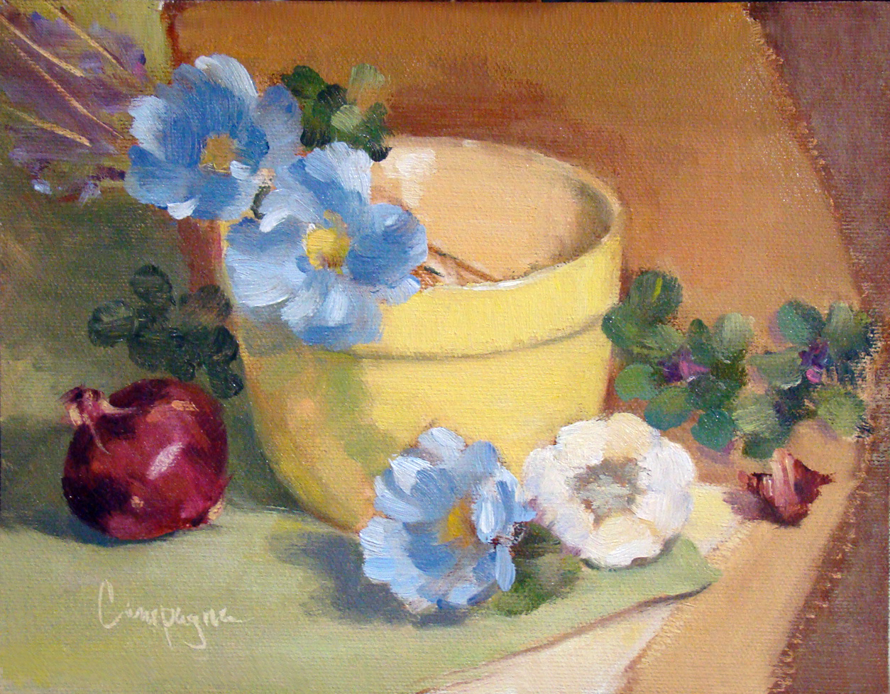
Yellow Bowl I
9 x 7 Oil on Canvas Panel
© 2013

The canvas panel was an 8 x 10 cut down to 9 x 7 inches; the color palette includes ultramarine blue, cad scarlet, cad yellow light and quinacridone magenta, and white - It is not a true use of the Fletcher system, but I did consider it when choosing the colors.

So back to the classical geometry...

When I did graphic design, grids were used to help arrange elements on the page for readability, and sometimes we tried to squeeze in a little something for visual interest that was less rigid. In this situation I just went with the grid similar to what the old masters may have used in designing their compositions.

This next image shows that grid superimposed to demonstrate what I mean. I did not consider the 'do not' put things in the middle of the picture plane, and 'do not' divide the picture plane in half. I just did what the grid suggested with an occasional 'offset' to keep from getting a headache. ;o)
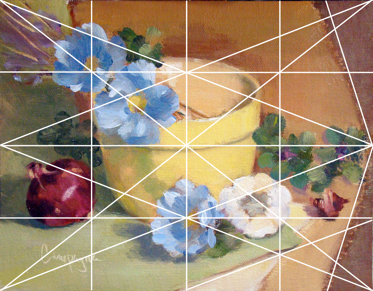
Grid_Yellow Bowl for demonstration purposes.


Several lines are left out with only major points emphasized like elements on the diagonal and and reciprocal (repeated) diagonals. Each of those smaller rectangles are exactly the same ratio as the main panel which I find rather interesting though this is probably obvious to math enthusiasts. (BTW, this grid is not the rule of thirds that artists sometimes default to when composing an image.) I believe 'harmonic armature' is the correct term for this type of grid - think of it like musical notes e.g., half notes, quarter notes, etc.

Since I did this painting myself using basic information, it is a little difficult to critique as good or bad. Of course, I do wonder what may have happened with this layout if I was not using a grid. My first thought is I may have put the bowl to the left and made other decisions about placement for the remaining objects. I do think I may be able to get more depth of field by changes in proportions with or without the grid - hmmmm.

There are other grid options of course, but I just went with 4, 8, etc. Eventually, I will attempt one in thirds and follow a similar breakdown - perhaps using like objects to see if the result is noticeably different.

As I get more comfortable with this way of looking at composition I will learn to include arches and semi-circles to move the eye through the picture plane, my hope is to create images that are more visually compelling for the viewer.

In any case, I welcome your feedback and hope you enjoyed this little demo on using a basic grid.

Wednesday, February 20, 2013

Sunflower and Tulips

OMGosh - I find myself doing a double take with this strong color combination. Not a delicate rendering by any means, but certainly catches my eye.

The sunflower was my main interest mainly because I am determined to paint them since I haven't been able to grow any in my garden.

Sunflower and Tulips - SOLD
6 x 8 inches on Canvas Panel
©2013
I am pretty sure I'll be painting more sunflowers and tulips soon...

Thursday, January 31, 2013

Yellow Poppies and Grapes

This is the last day of the 30 day paint challenge. Some of the artists painted something new every day and did a great job. For me it was do my best to simply paint every day and I made it for 25 of the 30 - something I haven't accomplished before!

I wanted to do one more so I could post on the last day of the challenge, and I might have to revisit this one for a few tweaks of course. ;o)

These yellow poppies are actually artificial, but I wanted to do something really bright and they fit the criteria. The grapes are real. Still working with red yellow and blue tones, but these are more varied in chroma than previous paintings.

Yellow Poppies and Grapes - SOLD
6 x 8 inches Oil on Canvas Panel
© 2013


Just a quick thanks to everyone who visits my blog to see what's new.
You are awesome.

Tuesday, January 29, 2013

Red, Yellow, Blue Update...

As I said, sometimes I have to revisit an image if it nags at me for some reason. This one needed less chroma in the background... and here's the result.


Red, Yellow, Blue - SOLD
5 x 7 Oil on Canvas Panel
© 2013


Sunday, January 27, 2013

Love painting garlic...

So here is the next little painting for the 30 day paint 'everyday' challenge. As promised, I put in fewer objects. I could render more detail since the subject could be larger to fill in the space.

Yes, I love painting garlic - the round and oval shapes are just too irresistible. I also did a dramatic color rendering while using a more muted background for a change. My kitchen tile has the background blue color with the burgundy accents. BTW, my kitchen also has a lots of beige tones (walls and counter top) so these colors do not seem overwhelming in the kitchen.

I like this little painting more than expected, and fewer objects in a small painting certainly has its benefits.

Colorful Garlic
7 x 5 Oil on Canvas Panel
© 2013