Showing posts with label painting. Show all posts

Thursday, April 19, 2018

Studio Campagna Oil Paintings - Toy Series...

I was 'toying' with the idea of painting a few still life with children's toys. This isn't a new concept, but one I've been wanting to do for awhile. The first below was done in 2016, and inspired me to do more.

I'm not going to rush through them, as I want to select items that appeal to me for the project. I would like them to hold a story that makes them more special somehow.

This is the first I'd like to share with you. The back story on this one isn't anything profound, but my love of painting hydrangeas and peonies just called out 'paint me.' The little toy clown is very old and beginning to show signs of wear and tear. I picked him up at a discount store years ago. It reminded me of my grandmother's porcelain dolls. He's only about 6 inches tall, and use to sit near my dressing mirror just for fun.

With very strong warm color, I was surprised by the result. It also seems to have a bit of a Victorian feel so I did some scratching on the panel to give it an aged look.

Toy Clown with Hydrangeas and Peonies
Framed - 8 x 8 inch canvas panel
© 2016
Price $ ebay auction + Shipping

I did't have any other toys laying around, so I had to recruit some new and gently used items for the next paintings. Now to find the other components for cohesive compositions. 

FYI: BTW - I'll be donating 35% of the proceeds from the series to a local charity - 
Foster Champs of Maple Valley, WA.

Thursday, December 25, 2014

What color system is on your palette?

I've been looking at color, playing with color, researching color, experiencing color, struggling with color, and doing lots of painting with color, and it all boils down to that knowing about color or color theory doesn't make one a master at color. 

It's a topic that will joyfully challenge me for the rest of my days, and I simply find it incredibly interesting.

As my understanding of color changed, my own palette changed definitely more than once. During the 30+ years that I've used color with oil painting and design work, I was  pleasantly surprised to find there is more than one color system to explore. At first I would get that overwhelmed feeling, and finally just settled on thinking of color in terms of systems. You've heard the riddle - how do you eat and elephant? (one bite at a time) - and that's how I began handling the world of color.

Simple not by any means, but the following is my basic breakdown of the most common systems that I am personally familiar with, and added a couple of fun things near the end. Hope this will be useful to you.
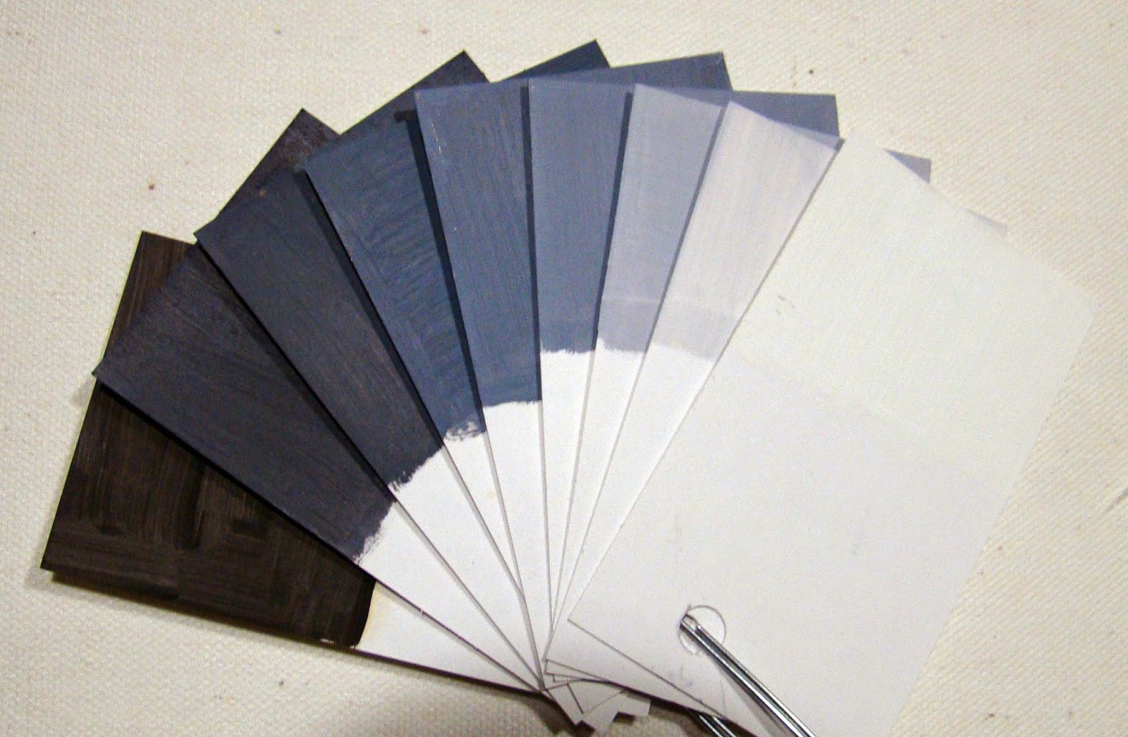
9 Value Scale B/W
 1) Black and White for value studies. Yes, I think of these as colors in pigment. The Black can be mixed chromatically from Red Yellow Blue mixes, or just used straight from a purchased tube with warm or cool undertones. Whites have these same warm cool undertones, and as your eye becomes more sensitive, you'll notice this right away. Value studies are a must for the beginner or anyone, and is still something I do to this day to help keep my eye trained. You will discover as you do your own painting that color makes seeing values more difficult.
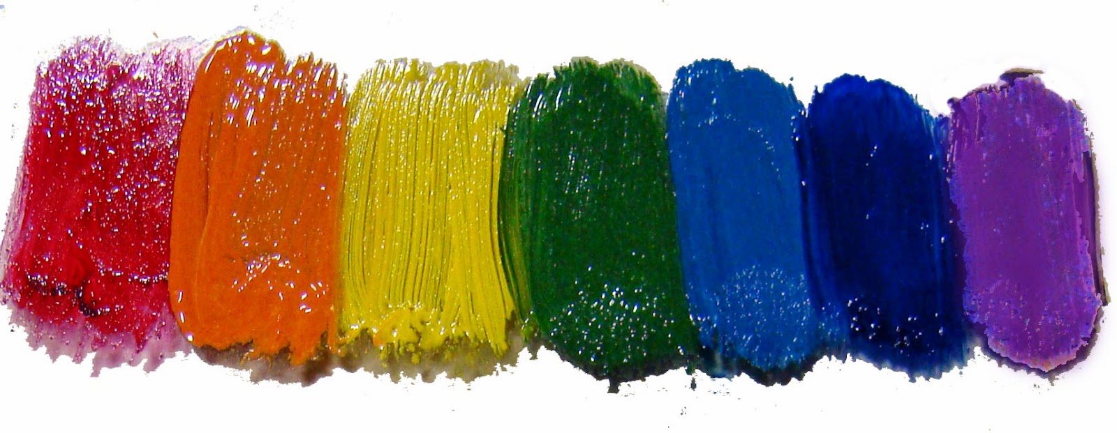

ROY G. BIV
2) The Rainbow colors; our first introduction to color, the one we learned in grade school - Mr. ROY G. BIV - red, orange, yellow, green, blue, indigo, and violet is quite like a rainbow. What a fun way to learn color. Later you will see its usefulness for a more sophisticated system.


Traditional Color Wheel
3) The Traditional 12 color wheel provides for an unlimited number of harmonies. The Red Yellow Blue 3 primary triad, the 3 secondary colors of orange, green, purple, and 6 tertiary colors. Complements, split complements; the wheel can be described with transparent colors, earth colors, and various opaque combinations, limited palette choices, and extensive ones. An artist can make any number of combinations with this basic wheel and never run out of options. How you use them on the canvas adds to the variety as well.


Munsell 3D
R Y G B V
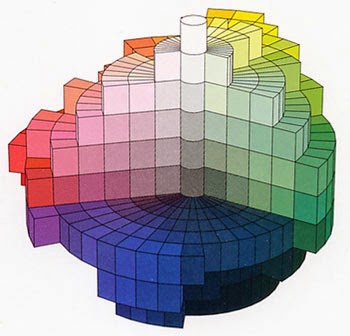
4) The Munsell system can be described in a wheel of colors, but it is better known by its emphasis on the three dimensions of color as in hue, value, and chroma as shown in the diagram on the left (good exercise for the brain). The Munsell System uses the primaries of red, purple, blue, green and yellow. I my thinking, this model actually embraces the first three mentioned above. Do you see the similarity of Munsell and Roy G. Biv?

5) Printing color systems: The Prang system was the first model used for commercial printing in the 1800's. It derived from lithography/block printing using inks. It also uses Red, Blue, and Yellow as a color model. Later CMYK (Cyan, Magenta, Yellow and Black) became the standard and is currently being used for most commercial print work. If you are going to do any serious reproduction work, you will want to become more familiar with this system.
Pantone/CMYK Conversion Chart
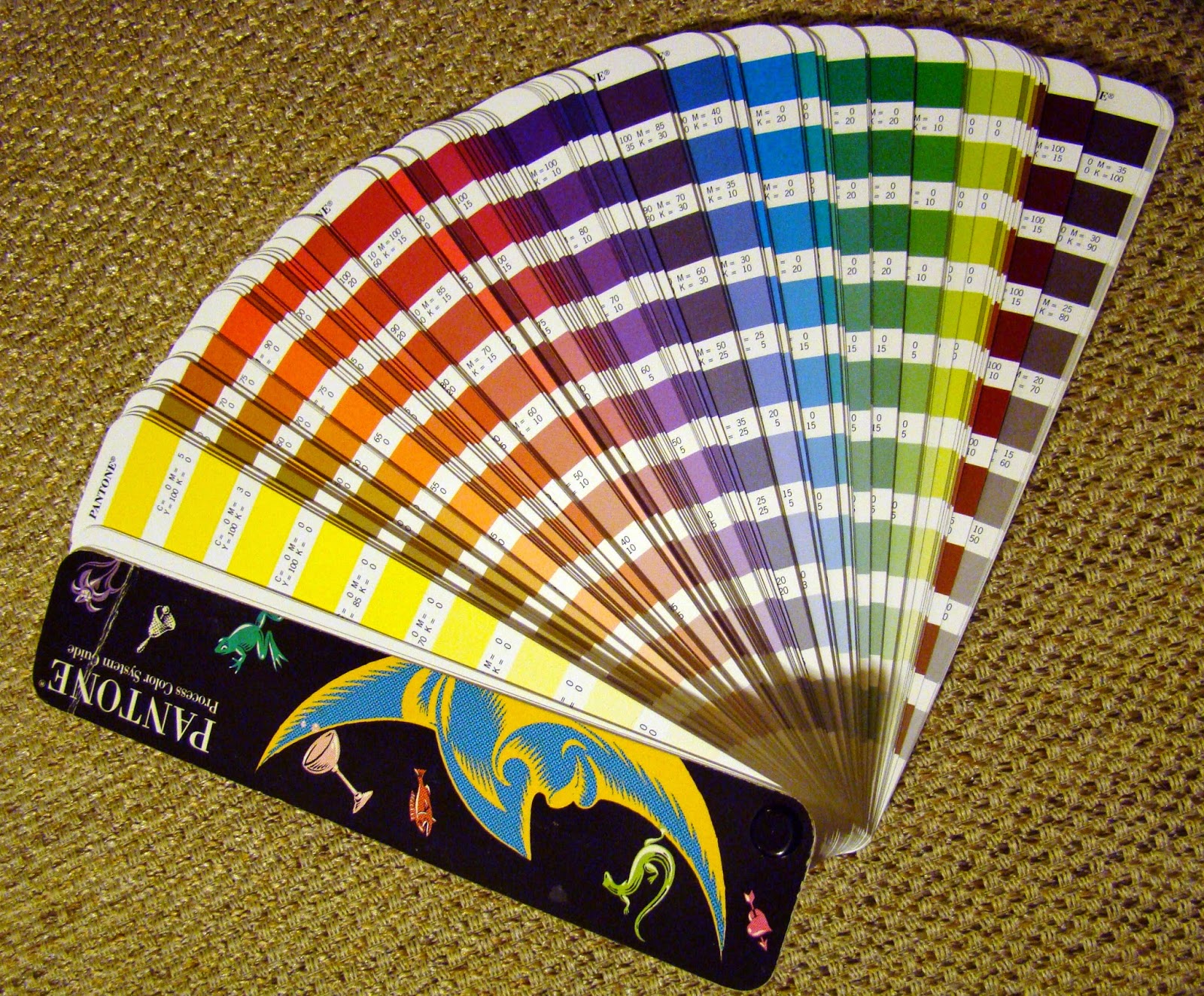
6) Designers' Color Systems use both the RGB computer model, and the CMYK ink system. The computer system deals with the RGB (Red, Green, Blue) as the primaries. These are the colors reflected on computer and TV screens using light rather than pigment and especially necessary in web design. This system requires a software program to convert the colors into CMYK for printing. Another commercial ink model is known as Pantone colors and has a full spectrum of ink colors - light to dark and pale to intense as shown on the right. The term Pantone is also a brand of ink, and offers the basic CMYK inks. Lots of fun, and an extensive topic for study if you take this route as a form of artistic expression.
Sherwin Williams Color Chart
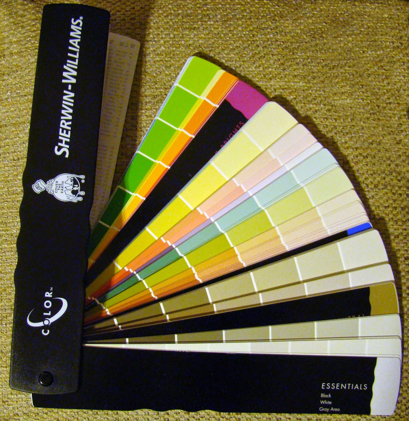
One more note on the Pantone colors is that these charts can be used to make choices for color harmonies on your palette, but they are expensive. An excellent and more affordable substitute for this kind of preliminary planning of your painting is an interior color chip sample from the hardware store, or a book, shown at left, that some manufactures provide for interior designers.

At some point in your color studies, you will likely come across the terms subtractive color (mixing pigment) and additive color (mixing light). You can find quite a bit on this via the web, but for our purposes here we are talking mostly about mixing paint pigment choices. There is a good book on this topic titled Blue and Yellow don't make Green by Wilcox.


So how exactly do you decide how to choose what to put on your palette as you embark on your painting adventure??? Well, I remember a time when I wanted to know what the 'right' colors were for my own palette. After all, I didn't want to make a mistake since my focus was to learn to paint the 'right' way! However, there was the question of personal style too! So if you are just beginning, try to look at it a little differently as you move forward with your own studies. Questions about what colors are best to have on your palette will be based on the result you are aiming towards. By asking what pigments will give me a good clear mix vs muted will become a more personal preference intermingled with theory and facts. For example: A blue and yellow don't always make a true green because the blue or yellow might have a ting of red that will alter the result of the mixture. For this reason, many artists will use a warm and cool of each primary on their palette to get better control of mixes.
Zorn Palette
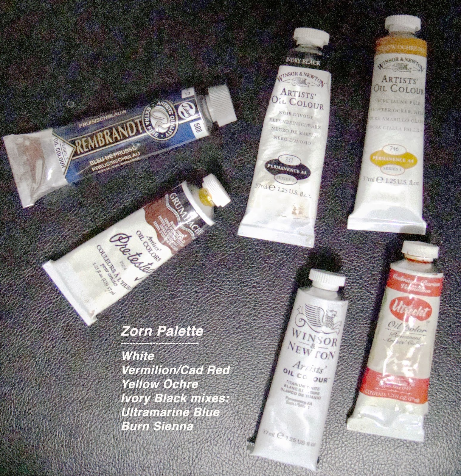
Should you use a limited palette? If a beginner, yes, but more experienced painters will too. Landscape painters often use a limited palette so not to have to carry a heavy load - it's for convenience. Maybe Alizarin Crimson, Cad Yellow, and Ultramarine Blue, with white in the field, and then add more colors when painting in the studio. Another limited palette is the 'Zorn Palette'; it will have a distinctive look, and when mastered will create beautiful images. This palette includes White, Yellow Ocher, Vermilion, and Warm and Cool Blacks - using ivory black mixed with either cobalt or burnt sienna. (These paint brands you see to the right are just some that I have on hand-there are many good brands.)


You might also ask what shape palette works best for arranging your color? Or how do you lay out your colors on the palette - light to dark, or chromatically? Which one will give you the best control for mixing? These are things that you will eventually decide for personal working habits. I have changed mine more than once on this too. Sometimes it is just a matter of what is convenient for the particular setup.

As you have likely come to realize, there are unlimited approaches to color and painting. While reviewing a few facts on the various color systems, I came across a website that shares 59 different Color System Theories!! Imagine that!!!

There is a color management system, not on the list, that comes to mind called the Fletcher System; this is using the traditional color wheel in a particular way to help a student learn color control. I will be writing more on this system in another post.

So much to study on color wouldn't you agree? How much do you NEED to know is up to you. For now, here is a link on Oil Color Palettes that currently has about 75 artists' palettes used by contemporary painters and old masters. Really fun to see...

Happy painting!!!

Monday, December 15, 2014

Onion Basket Oil Painting

Onions were the first food I ever attempted to draw, or paint. The shape, papery layers, and color variety are just perfectly tempting for oil painting.

Tried several variations on the arrangement before settling on this one. Wanted to work on looser brushwork and textural forms, and thought more variety would keep me from over focusing. Lots of different textures with glass, fabric, smoothness of onions, and roughness of the basket.

While finishing up with this painting, I had an 'aha moment' about selecting a visual idea for any painting; keeping the concept in mind while working on the painting, can be the real challenge.


Onion Basket
16 x 8 Oil on Canvas Panel
© 2014
Will post another onion piece soon still on the easel with less textural elements. Yikes, also running out of time to do an Xmas painting. Better get going... still catching up from my trip to Hawaii!! ;o)

Thanks for looking!

Tuesday, October 29, 2013

Ginger Jar with Tangerines and Blue Flowers - Update

So back to my more frequently used palette. I must say the understanding of color is more solid now that I've used the Zorn Palette the past few paintings. By this I mean how color affects the viewer.

This is a simple grouping of objects that have a full value range and intensity of color. My spirit is feeling a little brighter and more at home. The actual jar has a printed design of square calligraphy blocks that I left off because it seemed too busy, but actually thinking this is too plain.

BTW, the blue flowers are a variation of Scilla siberica and perennial Geranium.


Start -  Ginger Jar with Tangerines and Blue Flowers
8 x 10 Oil on Canvas Panel
© 2013

Decided to try it with the design afterall... left a lot of the design off, but it is pretty true to the actual idea. Now if I can just learn how to suggest depth more convincingly.

Update - Ginger Jar with Tangerines and Blue Flowers
8 x 10 Oil on Canvas Panel
© 2013

Saturday, October 26, 2013

Turban Squash - Still Life

This was getting back to my usual palette - and all I can say is what a difference. It shouts in comparison. Lots of fun to paint. Could end up in the oven...


Turban Squash - SOLD
6 x 6 Oil on Canvas Panel
© 2013

Friday, September 27, 2013

Portrait Study w/ the Zorn Palette

Haven't done a portrait for a long time even though it is one of my favorite subjects. I like painting from life, but usually difficult to find time and resources for this.

Since I've been exploring the Zorn Palette via the Online Watts Atelier, it seems that a good photo reference might be enough to get in some portrait practice. So I used one of their photos (part of an online lesson).

This lesson is done with an umber under painting and then painted in color with 'yup, you guessed it' the Zorn Palette.

Burnt Umber Portrait Underpainting
Burnt umber is, IMHO, a harsh color, and not a favorite of mine. I could have done more to refine this under painting, but I sometimes get impatient and move ahead if I anticipate learning something new. The resulting color study (painted over the under painting) was quite pleasant to do.

Portrait using the Zorn Palette
9x12 Oil on Canvas Sheet
Now the interesting thing is when I use to work at painting a portrait, I had all kinds of colors on my palette, and honestly confused myself on a regular basis. The Zorn Palette is still new for me, so I'm not 100% on point with its color values yet, and shadows are always difficult from a photo. However, I think this palette does a nice job of giving good flesh tones for a portrait painting.

Yes, I believe I'm going to try another soon... ;o)

Saturday, August 17, 2013

Master Study II - Rubens

The first time I did a master study was of the painting by Antonio Mancini, titled Resting.

This time I chose a painting by Peter Paul Rubens, titled The Last Supper. I am so taken by this one painting, that I view it every time I visit the Seattle Art Museum.
This link
will take you to the SAM web page of the image.

There are several other studies and paintings of this subject that Rubens and other painters have done throughout history, but this ONE I find incredibly special.

The perspective and arrangement of the group of men (the disciples) listening to the words  of Jesus (Yeshua, their rabbi and spirital teacher) is so perfectly presented. It literally elevates the importance of the words he is conveying to them. It is as if he is telling them a secret, and I want to hear too. The movement, and use of color are simply beautiful.

 
The Last Supper - Rubens (borrowed from web images)

Part of my motivation to paint this is to build on my understanding of the geometry in classical painting. So since Rubens is not taking any new live students at this time, I was trying to figure out how to obtain an image that would be more helpful than a printout of a web image. Then I decided to contact the Seattle Art Museum to see if they could assist.

Yes, was their reply!

I agreed to sign a use agreement, and for a small fee, they will send me an image through the mail that I will use for reference. I can hardly wait to get started! Thank you Seattle Art Museum.

OMGosh! I better get started on sizing and stretching my canvas...


Saturday, August 10, 2013

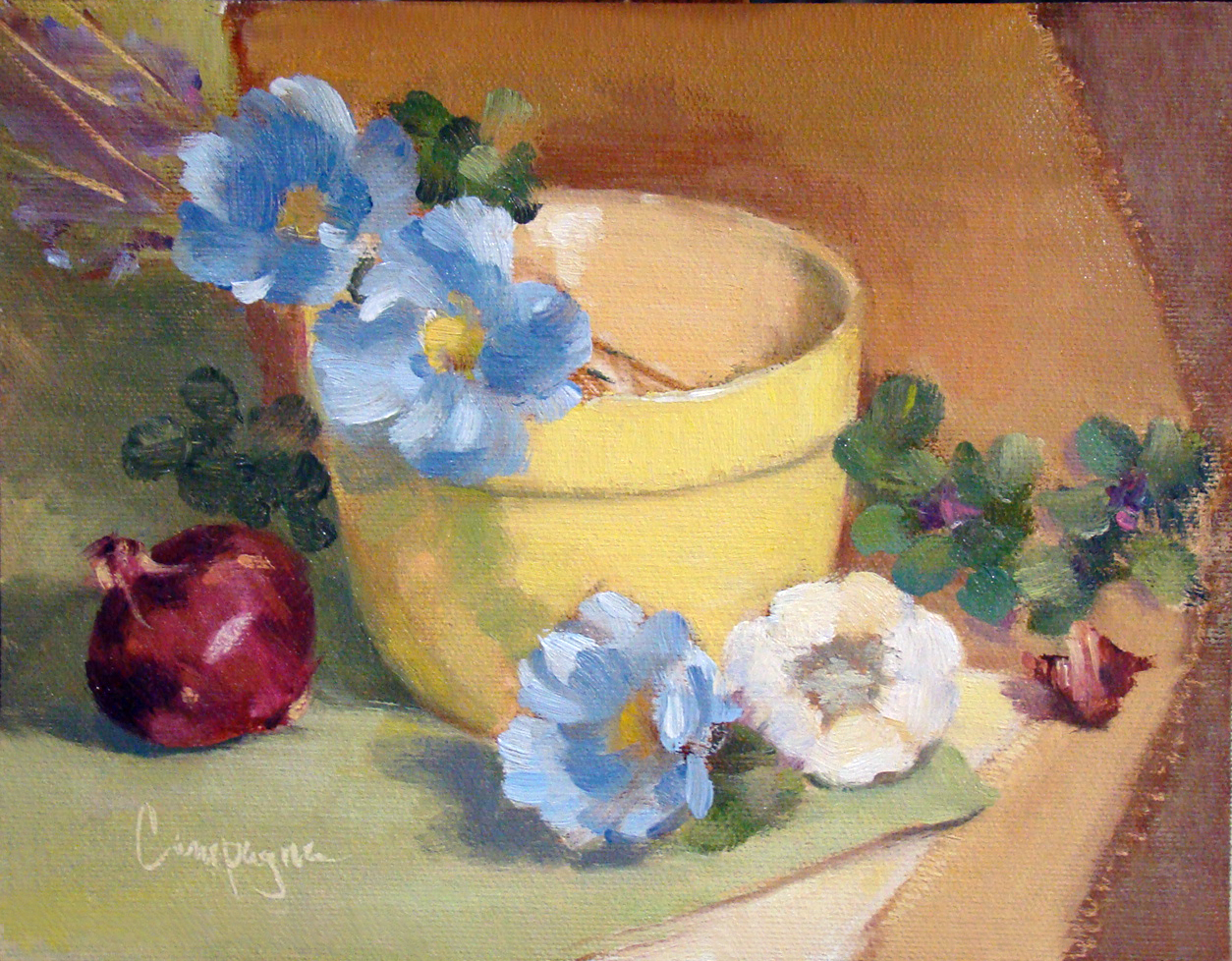
Step One - Classical Geometry Yellow Bowl, Poppies, and Onion

So here you have it. I've made my first step into the world of 'consciously' using classical geometry for composition.

Because I have so many canvas panels of proportions set by today's standards such as
6 x 8, 8 x 10, etc., I decided to simply use a grid that would divide the space by similar means without going to the phi rectangles, and root rectangles as the Masters did. This grid is known as a 'harmonic armature'.

So in my simple way this painting is the result selecting random objects placing along the grid lines. 

Yellow Bowl I
9 x 7 Oil on Canvas Panel
© 2013

The canvas panel was an 8 x 10 cut down to 9 x 7 inches; the color palette includes ultramarine blue, cad scarlet, cad yellow light and quinacridone magenta, and white - It is not a true use of the Fletcher system, but I did consider it when choosing the colors.

So back to the classical geometry...

When I did graphic design, grids were used to help arrange elements on the page for readability, and sometimes we tried to squeeze in a little something for visual interest that was less rigid. In this situation I just went with the grid similar to what the old masters may have used in designing their compositions.

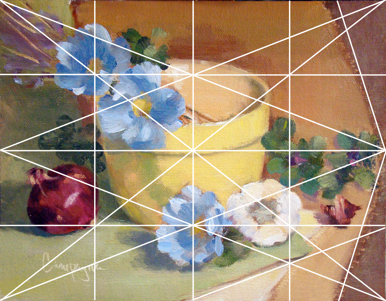
This next image shows that grid superimposed to demonstrate what I mean. I did not consider the 'do not' put things in the middle of the picture plane, and 'do not' divide the picture plane in half. I just did what the grid suggested with an occasional 'offset' to keep from getting a headache. ;o)

Grid_Yellow Bowl for demonstration purposes.


Several lines are left out with only major points emphasized like elements on the diagonal and and reciprocal (repeated) diagonals. Each of those smaller rectangles are exactly the same ratio as the main panel which I find rather interesting though this is probably obvious to math enthusiasts. (BTW, this grid is not the rule of thirds that artists sometimes default to when composing an image.) I believe 'harmonic armature' is the correct term for this type of grid - think of it like musical notes e.g., half notes, quarter notes, etc.

Since I did this painting myself using basic information, it is a little difficult to critique as good or bad. Of course, I do wonder what may have happened with this layout if I was not using a grid. My first thought is I may have put the bowl to the left and made other decisions about placement for the remaining objects. I do think I may be able to get more depth of field by changes in proportions with or without the grid - hmmmm.

There are other grid options of course, but I just went with 4, 8, etc. Eventually, I will attempt one in thirds and follow a similar breakdown - perhaps using like objects to see if the result is noticeably different.

As I get more comfortable with this way of looking at composition I will learn to include arches and semi-circles to move the eye through the picture plane, my hope is to create images that are more visually compelling for the viewer.

In any case, I welcome your feedback and hope you enjoyed this little demo on using a basic grid.

Saturday, July 20, 2013

Sacred Geometry in Classical Art

Mathematical studies of the Fibonacci Series and golden section/sacred geometry is not usually the priority for a fine art painter of today. We moderns don't think about sacred geometry too much - we mostly enjoy the act of painting and kinda ballpark the rule of thirds in our layout, and most often come up with pleasing compositions as we paint on the standard canvas sizes carried by art suppliers.

But I've been thinking a lot about the geometry used in classical art that defined the composition. The classic masters did use it. Learning how to draw a root2 or phi rectangle doesn't create a beautiful painting in itself, it does help us with proportions that can be used like a template to suit and support the original concept of the painting. Graphic design uses templates for columns and page layout, so why not fine art painting.

This youtube video may be a bit overstated with all the triangulations, but I do think it makes the point that the old masters used geometry in their work - sacred or not. 


Note: These lines are only to show points of interest in the overall two dimensional picture plane, and not intended to suggest perspective for a three dimensional illusion. Perspective and its lines of delineation are a separate area of study.

Saturday, July 06, 2013

Study of the classical renewed...

Since seeing the Rembrandt painting at the Seattle Art Museum (the Kenwood House Collection) this past Spring, I've become more and more curious about classical work regarding the methods of the old masters.

Rembrandt - Self Portrait
Oil on Canvas
ca. 1665

The self-portrait of Rembrandt is engaging. The composition, the quality of paint, everything about this painting screams at me, but the language sounds foreign. His small etchings had/have a quality that is compelling in a similar way. The other paintings in the show had/have something intriguing about them too - none of which I could quite put my finger on as a modern viewer... and in spite of years of art training, I felt inadequate - like something was missing in my understanding. Let me explain...

Selecting objects for a still life is always an exercise that challenges me. I see beauty in so many things and want to express it in a pleasing way that you might see it too. After selecting items, working with how do I arrange them - what size do I paint - and after  coming up with a passable solution, it changes several times during the process. And this I've discovered is one of the interesting things about classical work.

In a classical painting there is an underlying framework for composing the painting. You've heard of the 'golden section' or 'divine proportion', but there is a tremendous amount more to it, and many of us more modern painters have no idea about how to utilize it like the masters did for our compositions. Could it really make for better paintings and perhaps achieve a true masterpiece?

This process was used in painting and sculpture and all manner of the arts. Just like learning an instrument and or movements in dance, there are scales and fundamentals that one needs to learn before they can perform beautifully. The same goes for painting.

I know we always hear suggestions about selecting random elements and being spontaneous for my paintings, but for me this results in sooooo many failures and disappointments. So now, I fear I will become a snob of sorts rejecting efforts that are not 'designed' in a more classical way. ;o)

I have a good sense of layout as a graphic designer, but even this seems basic and not very artistic or satisfying with our modern way of doing things. I enjoy painting very much, but when I begin to paint I often ask myself if the world really needs another oil painting. Maybe not...?

However, for my next several painting efforts, my plan is to revisit some past images of my own doing to start from, and begin to learn how to actually 'design' a painting like the Masters might have done - using the same objects, and see if it makes a difference. Sounds like work, but what the heck - I like a good challenge.

BTW, the study resources I plan to use are based on the Barnstone Studio program. He has some free videos to preview on his site that immediately rang true for me.

During the next several posts I will share my experiences with this study.