
It's a topic that will joyfully challenge me for the rest of my days, and I simply find it incredibly interesting.
As my understanding of color changed, my own palette changed definitely more than once. During the 30+ years that I've used color with oil painting and design work, I was pleasantly surprised to find there is more than one color system to explore. At first I would get that overwhelmed feeling, and finally just settled on thinking of color in terms of systems. You've heard the riddle - how do you eat and elephant? (one bite at a time) - and that's how I began handling the world of color.
Simple not by any means, but the following is my basic breakdown of the most common systems that I am personally familiar with, and added a couple of fun things near the end. Hope this will be useful to you.
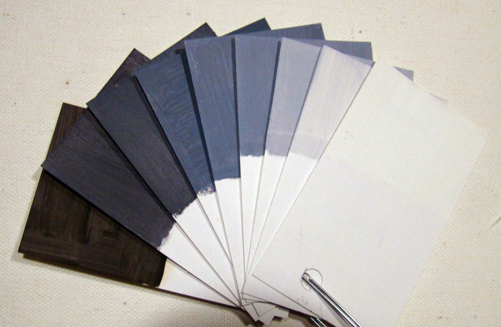 |
| 9 Value Scale B/W |
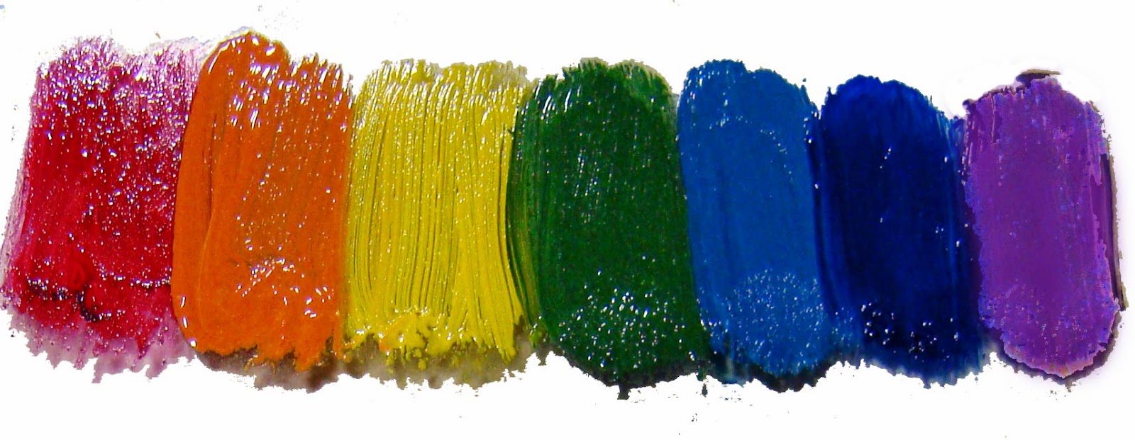 |
| ROY G. BIV |
 |
| Traditional Color Wheel |
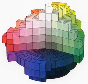 |
| Munsell 3D R Y G B V |
4) The Munsell system can be described in a wheel of colors, but it is better known by its emphasis on the three dimensions of color as in hue, value, and chroma as shown in the diagram on the left (good exercise for the brain). The Munsell System uses the primaries of red, purple, blue, green
and yellow. I my thinking, this model actually embraces the first three mentioned above. Do you see the similarity of Munsell and Roy G. Biv?
5) Printing color systems: The Prang system was the first model used for commercial printing in the 1800's. It derived from lithography/block printing using inks. It also uses Red, Blue, and Yellow as a color model. Later CMYK (Cyan, Magenta, Yellow and Black) became the standard and is currently being used for most commercial print work. If you are going to do any serious reproduction work, you will want to become more familiar with this system.
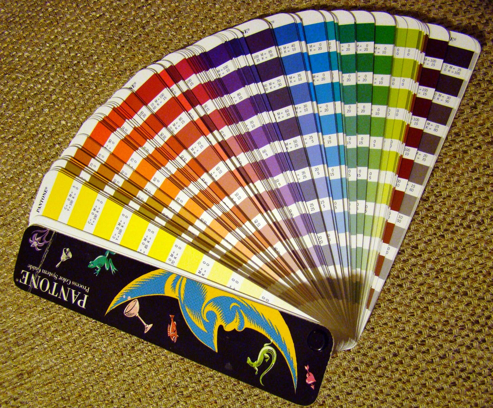 |
| Pantone/CMYK Conversion Chart |
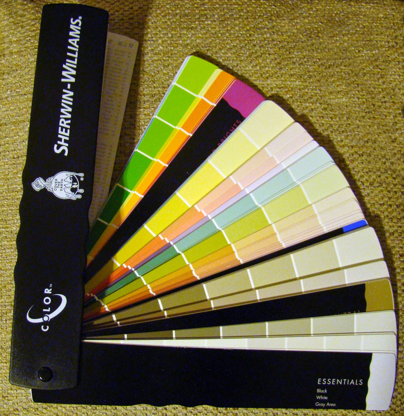 |
| Sherwin Williams Color Chart |
At some point in your color studies, you will likely come across the terms subtractive color (mixing pigment) and additive color (mixing light). You can find quite a bit on this via the web, but for our purposes here we are talking mostly about mixing paint pigment choices. There is a good book on this topic titled Blue and Yellow don't make Green by Wilcox.
So how exactly do you decide how to choose what to put on your palette as you embark on your painting adventure??? Well, I remember a time when I wanted to know what the 'right' colors were for my own palette. After all, I didn't want to make a mistake since my focus was to learn to paint the 'right' way! However, there was the question of personal style too! So if you are just beginning, try to look at it a little differently as you move forward with your own studies. Questions about what colors are best to have on your palette will be based on the result you are aiming towards. By asking what pigments will give me a good clear mix vs muted will become a more personal preference intermingled with theory and facts. For example: A blue and yellow don't always make a true green because the blue or yellow might have a ting of red that will alter the result of the mixture. For this reason, many artists will use a warm and cool of each primary on their palette to get better control of mixes.
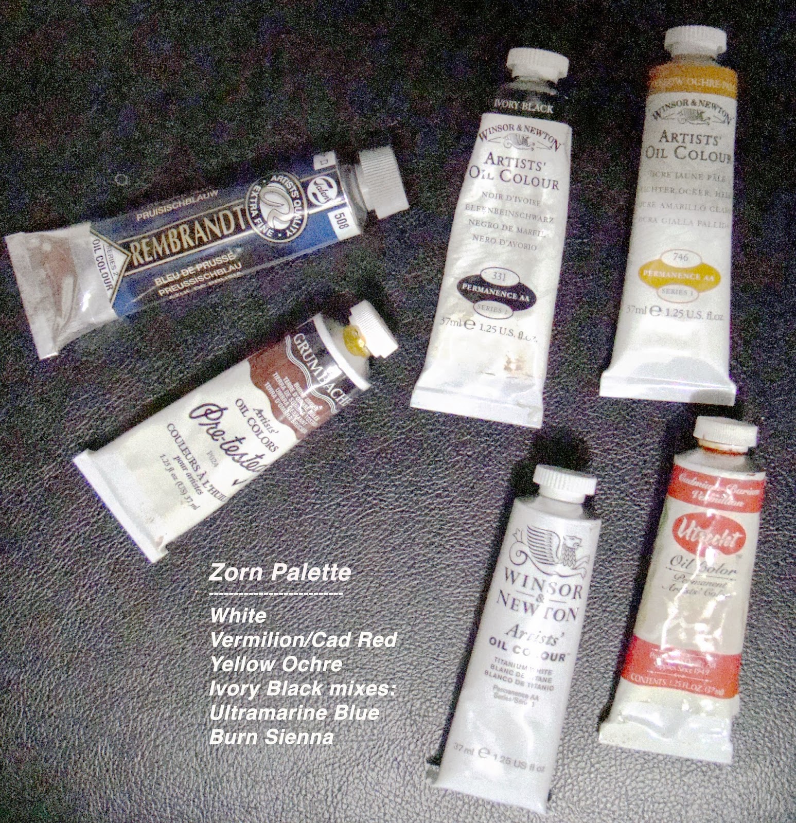 |
| Zorn Palette |
You might also ask what shape palette works best for arranging your color? Or how do you lay out your colors on the palette - light to dark, or chromatically? Which one will give you the best control for mixing? These are things that you will eventually decide for personal working habits. I have changed mine more than once on this too. Sometimes it is just a matter of what is convenient for the particular setup.
As you have likely come to realize, there are unlimited approaches to color and painting. While reviewing a few facts on the various color systems, I came across a website that shares 59 different Color System Theories!! Imagine that!!!
There is a color management system, not on the list, that comes to mind called the Fletcher System; this is using the traditional color wheel in a particular way to help a student learn color control. I will be writing more on this system in another post.
So much to study on color wouldn't you agree? How much do you NEED to know is up to you. For now, here is a link on Oil Color Palettes that currently has about 75 artists' palettes used by contemporary painters and old masters. Really fun to see...
Happy painting!!!
I really enjoyed reading this information packed post.
ReplyDeleteI appreciate the time you put into making it.