Monday, December 02, 2013

T'was the Night Before Xmas... Christmas Card Opt #2

I finally completed the second study for a Christmas card.

The photo of my Granddaughter was actually taken a couple of Christmas eves ago - so I thought the title fitting. She's sitting in her Great Grandma's chair that now resides at her Auntie's house.

It is a little brighter than I originally thought I would do, but it will be darker by default after it is printed. It is getting a little late to be working on a Christmas card image, but at least it will be ready for next year if I don't make it happen this year. ;o)

T'was the Night Before Xmas
9 x 12 Oil on Stretched Canvas
© 2013
NFS


Sunday, November 03, 2013

Christmas Card Landscape Sketch

I very much want to paint something for printing my own Christmas cards this year. The thought is for it to maybe be something that could be hung anytime of year. The following is the first quick sketch done for this goal.

You might be thinking that a yellow sky is unlikely for an evening/dusk scene, but that the imagination of it, and I kinda like the harmony. This is not the completed image, only a start... it is a composite of photo resources and imagination. I want to add something, but haven't quite settled on what(?).

Should it be something figurative, or something holiday related even though it would be counter to 'hung anytime of year'?

Will sketch out a couple more ideas before I make a final decision. Better get out to the easel!

Thanks for looking!

Prelim Sketch - Winter Landscape
9 x 12 Oil on Canvas Sheet
© 2013


Tuesday, October 29, 2013

Ginger Jar with Tangerines and Blue Flowers - Update

So back to my more frequently used palette. I must say the understanding of color is more solid now that I've used the Zorn Palette the past few paintings. By this I mean how color affects the viewer.

This is a simple grouping of objects that have a full value range and intensity of color. My spirit is feeling a little brighter and more at home. The actual jar has a printed design of square calligraphy blocks that I left off because it seemed too busy, but actually thinking this is too plain.

BTW, the blue flowers are a variation of Scilla siberica and perennial Geranium.


Start -  Ginger Jar with Tangerines and Blue Flowers
8 x 10 Oil on Canvas Panel
© 2013

Decided to try it with the design afterall... left a lot of the design off, but it is pretty true to the actual idea. Now if I can just learn how to suggest depth more convincingly.

Update - Ginger Jar with Tangerines and Blue Flowers
8 x 10 Oil on Canvas Panel
© 2013

Saturday, October 26, 2013

Turban Squash - Still Life

This was getting back to my usual palette - and all I can say is what a difference. It shouts in comparison. Lots of fun to paint. Could end up in the oven...


Turban Squash - SOLD
6 x 6 Oil on Canvas Panel
© 2013

Tuesday, October 15, 2013

Still Life - Footstool w/ Book

Well I proceeded with the still life I began a few days ago and this is the current result... whether I toss it or make some changes is yet to be determined.

In any case, my intent was to follow through with this effort... it's more like a quick study illustration to me than a 'beautiful painting'.

The charcoal drawing in the previous post had more drama even with the compositional challenges. What I love tho is the shadow of the candle stick on the left - the distortion is interesting.


Footstool w/ Book
9 x 7 Oil on Canvas Board
© 2013
I used the adapted Zorn palette again. I think the flower could be smaller, and the wine glass seems too busy. Those would be the main changes I would make with this. A more simple wine glass without all the faceted cuts that catch the light in strange ways. I'll also adjust the shadow color under the left side of the footstool.
 **********

2 hours later: could not leave it for tomorrow... had to make a few changes today - here's the result. Less detail in the wine glass/check! Slightly smaller flower/check! If I ever start another from scratch, I'd make it a bud instead of full bloom. Little darker in left side shadow under the footstool/check! Now I can do something else!

Revised Image
**********

Several Days Later: had a change of mind on the  tone of the green foot stool. It seemed to be competing with the flower.


Revised Image 2


Monday, September 30, 2013

Still Life - Blue Poppies with Yellow Ribbon

This was started several weeks ago, and just recently finished. I was looking for something simple to paint on a 5 x 7 canvas panel that I had for awhile and thought it should get used. I've got so much 'stuff' in my studio that it's a wonder I can find anything... but that's a discussion for another day.

Blue Poppies with Yellow Ribbon
5 x 7 Oil on Canvas Panel
© 2013
So this is ready to be posted on the last day of the 30 day challenge... I didn't make it everyday this time again, but it did get me painting at least some, and for that I'm grateful.

Along that line of thinking (painting daily), I read a book title 'The ONE Thing' authors Gary Keller and Jay Papasan. It's about achieving extraordinary results (also part of the title). If you are looking for a truthful straightforward read on doing your best at what you love, then I recommend reading this book.

Friday, September 27, 2013

Portrait Study w/ the Zorn Palette

Haven't done a portrait for a long time even though it is one of my favorite subjects. I like painting from life, but usually difficult to find time and resources for this.

Since I've been exploring the Zorn Palette via the Online Watts Atelier, it seems that a good photo reference might be enough to get in some portrait practice. So I used one of their photos (part of an online lesson).

This lesson is done with an umber under painting and then painted in color with 'yup, you guessed it' the Zorn Palette.

Burnt Umber Portrait Underpainting
Burnt umber is, IMHO, a harsh color, and not a favorite of mine. I could have done more to refine this under painting, but I sometimes get impatient and move ahead if I anticipate learning something new. The resulting color study (painted over the under painting) was quite pleasant to do.

Portrait using the Zorn Palette
9x12 Oil on Canvas Sheet
Now the interesting thing is when I use to work at painting a portrait, I had all kinds of colors on my palette, and honestly confused myself on a regular basis. The Zorn Palette is still new for me, so I'm not 100% on point with its color values yet, and shadows are always difficult from a photo. However, I think this palette does a nice job of giving good flesh tones for a portrait painting.

Yes, I believe I'm going to try another soon... ;o)

Monday, September 16, 2013

Beginning a new Still Life

Process...

I love to relax and read so I thought I'd do a little painting about this.

I typically start my paintings direct from the set up I arrange by using paint and brush to draw onto the canvas. It has served me well, and I am able to make adjustments as needed at this stage because the oils are somewhat forgiving that way. But there is a downside to this as you will read below.

I wanted to practice my drawing because it is not only good for my skills in general, but drawing is also relaxing and fun for me, and it assists in working out some of the inevitable problems of an arrangement that usually show up while working on the painting when it is more difficult to make changes. Instead of investing a couple of hours on the painting figuring out my lay in, doing a charcoal or pencil study can be more efficient and not feel so 'expensive' when I am not satisfied with the result.

So this little charcoal drawing is just that - a prelim-study (more than a thumbnail sketch). After all, the masters did it that way, so who am I to argue. Just think of the patience and effort they put into their masterpieces! 

Still Life Study
10 x 10 Charcoal on Newsprint
© 2013
As I look at the study, I think it needs some breathing room rather than clustering all the objects so closely together. I can do this by adjusting the set up now before beginning the actual painting. I also think I'll use different candles - maybe one used candle would be better, and a wine glass to bring another human element to the set up.

You can see my marks for the 'notional space' of the objects and a border area beyond it. I like to do this to see what my canvas size will be, and if I need to make adjustments. The changes I'm anticipating will also likely change the format from squarish to a more horizontal rectangle. I will plan to post an intermediate stage for the painting after the changes.

BTW, as a side note, I started reading The Practice and Science of Drawing by Harold Speed. There are technical aspects and examples in this read, but there are also some unexpected concepts as well, and I recommend it. A quote from the book's content...

'Art is the expression of the invisible by means of the visible.' Eugene Fromentin

Thursday, September 12, 2013

Mums with Large Vase and Ginger Jar

Did I say I joined the 30 day challenge?

Yes I did, and I finally have 'a' painting that I can actually claim to have painted this month!

I worked on this about three days and I am going to make it count even though I finished on day 12... Geezzzzz
 To continue...
I worked on this with a very limited palette. I was intended to try the 'Zorn Palette', but found it less appealing the more I worked with it. Soooooo... instead of using ivory black, I mixed my black with transparent red oxide and ultramarine blue. I tuned my yellow ochre with some cadmium yellow light, and used only a small bit of vermillion which I did not change, and actually only used a smidge of it since the TRO was more useful on this arrangement. Last, but not least, included in the 'Zorn Palette' is white.

My point in this explanation is that a limited palette can be a blessing when it comes to creating harmony, but also a darn curse if you crave more color as I did in this painting.

(The blue areas would have been black and shades of gray if I didn't make the changes explained earlier.)

Mums in Large Vase w/Small Ginger Jar - SOLD
11 x 14 Oil on Canvas Panel
@ 2013

Saturday, August 17, 2013

Master Study II - Rubens

The first time I did a master study was of the painting by Antonio Mancini, titled Resting.

This time I chose a painting by Peter Paul Rubens, titled The Last Supper. I am so taken by this one painting, that I view it every time I visit the Seattle Art Museum.
This link
will take you to the SAM web page of the image.

There are several other studies and paintings of this subject that Rubens and other painters have done throughout history, but this ONE I find incredibly special.

The perspective and arrangement of the group of men (the disciples) listening to the words  of Jesus (Yeshua, their rabbi and spirital teacher) is so perfectly presented. It literally elevates the importance of the words he is conveying to them. It is as if he is telling them a secret, and I want to hear too. The movement, and use of color are simply beautiful.

 
The Last Supper - Rubens (borrowed from web images)

Part of my motivation to paint this is to build on my understanding of the geometry in classical painting. So since Rubens is not taking any new live students at this time, I was trying to figure out how to obtain an image that would be more helpful than a printout of a web image. Then I decided to contact the Seattle Art Museum to see if they could assist.

Yes, was their reply!

I agreed to sign a use agreement, and for a small fee, they will send me an image through the mail that I will use for reference. I can hardly wait to get started! Thank you Seattle Art Museum.

OMGosh! I better get started on sizing and stretching my canvas...


Saturday, August 10, 2013

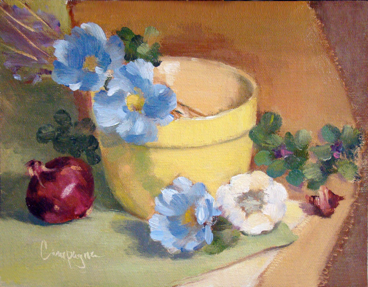
Step One - Classical Geometry Yellow Bowl, Poppies, and Onion

So here you have it. I've made my first step into the world of 'consciously' using classical geometry for composition.

Because I have so many canvas panels of proportions set by today's standards such as
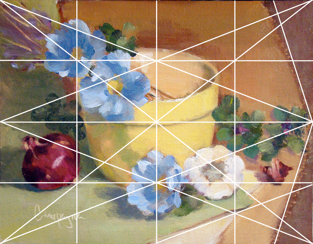
6 x 8, 8 x 10, etc., I decided to simply use a grid that would divide the space by similar means without going to the phi rectangles, and root rectangles as the Masters did. This grid is known as a 'harmonic armature'.

So in my simple way this painting is the result selecting random objects placing along the grid lines. 

Yellow Bowl I
9 x 7 Oil on Canvas Panel
© 2013

The canvas panel was an 8 x 10 cut down to 9 x 7 inches; the color palette includes ultramarine blue, cad scarlet, cad yellow light and quinacridone magenta, and white - It is not a true use of the Fletcher system, but I did consider it when choosing the colors.

So back to the classical geometry...

When I did graphic design, grids were used to help arrange elements on the page for readability, and sometimes we tried to squeeze in a little something for visual interest that was less rigid. In this situation I just went with the grid similar to what the old masters may have used in designing their compositions.

This next image shows that grid superimposed to demonstrate what I mean. I did not consider the 'do not' put things in the middle of the picture plane, and 'do not' divide the picture plane in half. I just did what the grid suggested with an occasional 'offset' to keep from getting a headache. ;o)

Grid_Yellow Bowl for demonstration purposes.


Several lines are left out with only major points emphasized like elements on the diagonal and and reciprocal (repeated) diagonals. Each of those smaller rectangles are exactly the same ratio as the main panel which I find rather interesting though this is probably obvious to math enthusiasts. (BTW, this grid is not the rule of thirds that artists sometimes default to when composing an image.) I believe 'harmonic armature' is the correct term for this type of grid - think of it like musical notes e.g., half notes, quarter notes, etc.

Since I did this painting myself using basic information, it is a little difficult to critique as good or bad. Of course, I do wonder what may have happened with this layout if I was not using a grid. My first thought is I may have put the bowl to the left and made other decisions about placement for the remaining objects. I do think I may be able to get more depth of field by changes in proportions with or without the grid - hmmmm.

There are other grid options of course, but I just went with 4, 8, etc. Eventually, I will attempt one in thirds and follow a similar breakdown - perhaps using like objects to see if the result is noticeably different.

As I get more comfortable with this way of looking at composition I will learn to include arches and semi-circles to move the eye through the picture plane, my hope is to create images that are more visually compelling for the viewer.

In any case, I welcome your feedback and hope you enjoyed this little demo on using a basic grid.

Saturday, July 20, 2013

Sacred Geometry in Classical Art

Mathematical studies of the Fibonacci Series and golden section/sacred geometry is not usually the priority for a fine art painter of today. We moderns don't think about sacred geometry too much - we mostly enjoy the act of painting and kinda ballpark the rule of thirds in our layout, and most often come up with pleasing compositions as we paint on the standard canvas sizes carried by art suppliers.

But I've been thinking a lot about the geometry used in classical art that defined the composition. The classic masters did use it. Learning how to draw a root2 or phi rectangle doesn't create a beautiful painting in itself, it does help us with proportions that can be used like a template to suit and support the original concept of the painting. Graphic design uses templates for columns and page layout, so why not fine art painting.

This youtube video may be a bit overstated with all the triangulations, but I do think it makes the point that the old masters used geometry in their work - sacred or not. 


Note: These lines are only to show points of interest in the overall two dimensional picture plane, and not intended to suggest perspective for a three dimensional illusion. Perspective and its lines of delineation are a separate area of study.

Saturday, July 13, 2013

'Why' do artists paint on canvas and linen?


As a beginning painter, or a beginner of anything, we almost always followed the lead given by the instructor(s) providing the 'how to' - isn't that what we always do to learn something new - whether mimicking our parents as children, or how to do 'math' in school. We simply do what the current authority figure does or says, and that's how we learn.

On the topic of oil painting, I love the texture and other qualities of oil paint - so when I decided to learn to paint, it was naturally my choice of medium. Learning how to use it well isn't so simple. In fact it is more difficult than math in someways, wouldn't you agree? ;o)

So now that I've begun to study the classical proportions of a picture plane, and as I go along learning, I decided to use rolls of canvas and/or linen so I can cut my own specific  sizes. Using the past information given to me by 'several' authorities on painting who seem to have a wide range of approaches to things, it was no surprise to me that while warming my morning coffee, a question pops into my head asking 'why' do artists paint on canvas and linen?

I mean, we have so many materials to chose from, why fabric for fine art? At first impression, fabric brings to mind things like dyed cloth for clothing, and embroidery on dish towels. While I appreciate that both these examples can be beautiful, neither of them makes the leap in my mind to the idea of fine art.

So the best I can discern is this:

1) The obvious is that linen and canvas are light weight and much easier to transport than say a venetian plaster wall. One can stretch it on bars made into frames for showing, mount it on a rigid support, or roll it up for safe keeping.

2) Linen and canvas allows for better adhesion of the paint so it doesn't flake off as with a wooden panel or plaster surface.

3) And three, 'linen' especially gives a quality to the image that I personally find difficult to resist.

In design we learn that 'Form follows function', but once you get past the functional and practical aspects, it becomes, and is, more of an aesthetic thing.

As it turns out, after considering my thoughts I did a little research, and discovered I wasn't so far off in my thinking for the first two reasons listed. The Wikipedia resource suggests the same reasons for using fabric. See Oil Painting.

However, the third reason I mention is the 'WHY' that might be more elusive to identify (and not in Wikipedia), especially if you don't have the same aesthetic sensibilities.

I've painted on glass, wood, metal, rocks, canvas, and paper for oil painting, but linen is by far most appealing to me. I can mount it if I want a rigid surface, I can stretch it and experience a pleasurable 'give and take' with the surface as I apply paint. It can be used with or without a ground depending on purposes of the final image. I can be scrub into linen, or lay down paint smoothly and lightly; I can apply thin paint washes, or build up texture on the surface making it more sculptural. If I change my mind, I can wipe it away and begin again, and so it goes.

Fabric, especially linen, is simply a wonder surface to work on. Hmmm... wonder who the first person was who tried it?

Saturday, July 06, 2013

Study of the classical renewed...

Since seeing the Rembrandt painting at the Seattle Art Museum (the Kenwood House Collection) this past Spring, I've become more and more curious about classical work regarding the methods of the old masters.

Rembrandt - Self Portrait
Oil on Canvas
ca. 1665

The self-portrait of Rembrandt is engaging. The composition, the quality of paint, everything about this painting screams at me, but the language sounds foreign. His small etchings had/have a quality that is compelling in a similar way. The other paintings in the show had/have something intriguing about them too - none of which I could quite put my finger on as a modern viewer... and in spite of years of art training, I felt inadequate - like something was missing in my understanding. Let me explain...

Selecting objects for a still life is always an exercise that challenges me. I see beauty in so many things and want to express it in a pleasing way that you might see it too. After selecting items, working with how do I arrange them - what size do I paint - and after  coming up with a passable solution, it changes several times during the process. And this I've discovered is one of the interesting things about classical work.

In a classical painting there is an underlying framework for composing the painting. You've heard of the 'golden section' or 'divine proportion', but there is a tremendous amount more to it, and many of us more modern painters have no idea about how to utilize it like the masters did for our compositions. Could it really make for better paintings and perhaps achieve a true masterpiece?

This process was used in painting and sculpture and all manner of the arts. Just like learning an instrument and or movements in dance, there are scales and fundamentals that one needs to learn before they can perform beautifully. The same goes for painting.

I know we always hear suggestions about selecting random elements and being spontaneous for my paintings, but for me this results in sooooo many failures and disappointments. So now, I fear I will become a snob of sorts rejecting efforts that are not 'designed' in a more classical way. ;o)

I have a good sense of layout as a graphic designer, but even this seems basic and not very artistic or satisfying with our modern way of doing things. I enjoy painting very much, but when I begin to paint I often ask myself if the world really needs another oil painting. Maybe not...?

However, for my next several painting efforts, my plan is to revisit some past images of my own doing to start from, and begin to learn how to actually 'design' a painting like the Masters might have done - using the same objects, and see if it makes a difference. Sounds like work, but what the heck - I like a good challenge.

BTW, the study resources I plan to use are based on the Barnstone Studio program. He has some free videos to preview on his site that immediately rang true for me.

During the next several posts I will share my experiences with this study.


Saturday, June 22, 2013

Shiny Pots and Posies...

One thing that catches my interest as a painter is how reflections play out in a painting, specifically how they worked on shiny metal containers. Even if they are not in shadow, they are still reflected light, yes? So I painted the following two - one copper and one brass.


Copper Pot, Grapes and Posies - SOLD
8 x 10 Oil on Linen Panel
© 2013


Brass, Mini Tangerines and Posies
8 x 10 Oil on Linen Panel
© 2013

Friday, June 14, 2013

Fe, Phi, Fo, Fum - I smell the blood of an Englishman!

I had to share this Myron Barnstone video - He is 80 years young (when I wrote this post), and opinionated in the best possible way. 

In this video, he shares his take on the ongoing question "What is Art"?


Don't you love it???

Myron Barnstone has passed away now 10/29/16, but his daughter is keeping his legacy going.
She has started a Facebook page also to help his students stay connected.

Wednesday, February 20, 2013

Sunflower and Tulips

OMGosh - I find myself doing a double take with this strong color combination. Not a delicate rendering by any means, but certainly catches my eye.

The sunflower was my main interest mainly because I am determined to paint them since I haven't been able to grow any in my garden.

Sunflower and Tulips - SOLD
6 x 8 inches on Canvas Panel
©2013
I am pretty sure I'll be painting more sunflowers and tulips soon...

Thursday, January 31, 2013

Yellow Poppies and Grapes

This is the last day of the 30 day paint challenge. Some of the artists painted something new every day and did a great job. For me it was do my best to simply paint every day and I made it for 25 of the 30 - something I haven't accomplished before!

I wanted to do one more so I could post on the last day of the challenge, and I might have to revisit this one for a few tweaks of course. ;o)

These yellow poppies are actually artificial, but I wanted to do something really bright and they fit the criteria. The grapes are real. Still working with red yellow and blue tones, but these are more varied in chroma than previous paintings.

Yellow Poppies and Grapes - SOLD
6 x 8 inches Oil on Canvas Panel
© 2013


Just a quick thanks to everyone who visits my blog to see what's new.
You are awesome.

Tuesday, January 29, 2013

Red, Yellow, Blue Update...

As I said, sometimes I have to revisit an image if it nags at me for some reason. This one needed less chroma in the background... and here's the result.


Red, Yellow, Blue - SOLD
5 x 7 Oil on Canvas Panel
© 2013


Sunday, January 27, 2013

Love painting garlic...

So here is the next little painting for the 30 day paint 'everyday' challenge. As promised, I put in fewer objects. I could render more detail since the subject could be larger to fill in the space.

Yes, I love painting garlic - the round and oval shapes are just too irresistible. I also did a dramatic color rendering while using a more muted background for a change. My kitchen tile has the background blue color with the burgundy accents. BTW, my kitchen also has a lots of beige tones (walls and counter top) so these colors do not seem overwhelming in the kitchen.

I like this little painting more than expected, and fewer objects in a small painting certainly has its benefits.

Colorful Garlic
7 x 5 Oil on Canvas Panel
© 2013

Saturday, January 26, 2013

Sunflowers, Hydrangea and Orange

Since I signed up for a 30 day challenge (my version is to paint everyday - finish or not), I decided to work on something smaller and see how much time I actually spent on it. I spent two days with a total of 4+/- hrs including setup to do this image. I think I'll do a few more small images and take a break from the two large paintings while I get a better handle on what I want to do with them.


Sunflowers, Hydrangea and Orange
6 x 6 Oil on Canvas Panel
© 2013

This little painting I just threw a few things together that I've been thinking about painting. I hadn't planned on putting them all in the same setup, but that's what happened. I have a tendency to compose a setup more suited to be a larger painting. I think the next one will have fewer objects.


Price $25.00


Thursday, January 24, 2013

Paint Two Images - Stage 3

Finally stopped fussing about these two paintings and settled on laying in some color ground suggesting a landscape. It's all very loose and I've decided to allow these two paintings to develop in steps without a real definite plan. That means things may change quite a bit before I'm done. Should be interesting - or not. ;o)


Title TBD - Stage 3
16 in x 20 in each - Oil on Stretched Canvas
© 2013


Paint Two Images
Paint Two Images - Stage 2

Monday, January 21, 2013

"Paint Two Images..." - Stage 2

It has been about 6 months since I posted anything about this project regarding the 'Paint Two Images Project'. It seems no matter how important a project is, it doesn't mean it is going to happen quickly, and this is definitely one of those projects.

I think about this project almost daily, and have mulled over old drawings, and new drawings, and lots of ideas about what these two images should be. All in all, I kept returning to a figurative theme, and here is the next stage of the project.


Title TBD - Originals Not for Sale
16 x 20 inches - Oil on Stretched Canvas
© 2013
While researching for this project, I came across one charcoal drawing and one ink drawing that were done in 1980's during figure drawing classes. When I drew them, I didn't know I would be using them in the future - the thought never occurred to me. The female model was done during a fashion illustration course, and the male model is actually a dancer who modeled for art students in Seattle. The originals were done about 4 years apart, and I was a little surprised to see how little the style of my drawings changed.

As I develop the idea for these paintings I became keen on using symbolism, and I am leaving it open for interpretation. Several thoughts have swept across my mind about what it might mean, but I tell you 'it changes' a bit even though some passages are constant. It is like different layers of understanding are represented.

The actual rendering of the image is not determined because of the difficulty of finding and affording models to work from, so in the interest of allowing these paintings to develop as I go along, they may likely be left to look very graphic rather than realistic. BTW, I am working on them simultaneously as though it is one large painting. This should keep them looking harmonious both in style and color.

I have some ideas for the background, and will be posting that result I hope in the near future. I have resolved that no matter what the result of these paintings, they will be framed and put on the wall.

Tuesday, January 15, 2013

30 Day Challenges vs Master Study

It seems that the 30 day blog post, or producing a painting a day for 30 days is popular in January and a couple other times during the year. I think this works really well for the challenging yourself, but not so good for others - like me.

After a little consideration motivated by truly wanting to be more productive, I signed up for a 30 day challenge knowing right up front that it had to be adjusted a bit to suit my work life.

Instead of cranking out just any ol' blog post, IMO, I think it requires interesting content to make it valuable to the reader, and I just don't think I have that much to say that many would find interesting. I tend to be more of an internal processor, with occasional inspiration to tell a story.

Or in the case of completing a painting every day, OMGosh - I just know I wouldn't do well working that way. It makes me nervous and frantic just like trying to write something new and interesting everyday.

I am certain there is value in these activities with lots of starts and generating ideas - but to produce a final result every single day is just toooooo stressful for me at my current level of development!

So, I decided to give myself a slightly altered challenge and promise to paint everyday. Work on a painting I'm interested in producing, and work on it a little everyday. And glory be - I am succeeding!

Mancini Study in Reverse - NFS
8 x 16 Oil on canvas
© 2012
(Resting - 25 3/8” x 39 5/8” Mancini - c. 1887)
http://fetishofsilence.tumblr.com/post/26372840522/antonio-mancini-resting-c-1887-oil-on-canvas

This painting is the result of the last week's activity. It is a study from a painting by one of my favorite painters - Antonio Mancini. http://en.wikipedia.org/wiki/Antonio_Mancini. The painting resides at the Chicago Art Institute.

I chose this one because of the contradictions embodied in this painting that I completely enjoy. The composition is done with a half and half split - darks and lights  almost equal, and a few other oddities we are taught not to do. I had to paint it to see if I could understand why I liked it sooooo much. (BTW, I did it in reverse to see if it worked both ways.)

My brushwork is not the same as Mancini, and I could spend many more hours improving on this painting. I only had a computer printout, and haven't had the privilege of viewing it in person. There are other obvious differences besides brushwork, but my pursuit of learning and understanding this painting made it worth the week's effort. I highly recommend selecting master paintings for study - there is much to be learned from this process - just be sure to give the master their due credit.